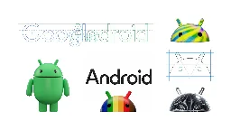
A new modern look for the Android brand
A new modern look for the Android brand
blog.google A new modern look for the Android brand
This evolution of our visual identity better represents Android’s core ethos of being open, iterative and inclusive — and it’s fun, too.

The bugdroid is now in 3D lol
You're viewing a single thread.
View all comments
46
comments
Looks like Android put on some weight.
12 0 ReplyToo much upside down cake perhaps?
7 0 Reply
You've viewed 46 comments.
Scroll to top