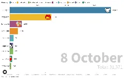
Timeline of total users at the top 10 Lemmy instances
Timeline of total users at the top 10 Lemmy instances
public.flourish.studio Timeline of total users at the top 10 Lemmy instances
A Flourish data visualisation by Gabino3503

A timeline I created of the total users at the top 10 Lemmy instances as a bar chart race: https://public.flourish.studio/visualisation/14058992/ and as a line chart: https://public.flourish.studio/visualisation/14080522/.
You're viewing a single thread.
View all comments
5
comments
Is there a time-series plot version of this? I always have difficulty really absorbing the data when it is animated like that.
1 0 Reply