Can we (please) have Voyager’s multireddit migration tool?
Can we (please) have Voyager’s multireddit migration tool?
Arctic is a (much) better Lemmy client than any other out there for iOS at least but there are some nifty features for the most recommended app Voyager like the ability to disable side swipes altogether because Apollo’s (reddit) double-tap to upvote for example is much intuitive where side swipes are used to enter and exit communities, posts, comments, menus, settings… or whole app together on Android or Jailbroken devices.
This is my multireddit link after removing u/user which were included as r/_u/redditor from an existing bug to test this for Arctic which would fully enable me along with a lot of us to leave Voyager behind.
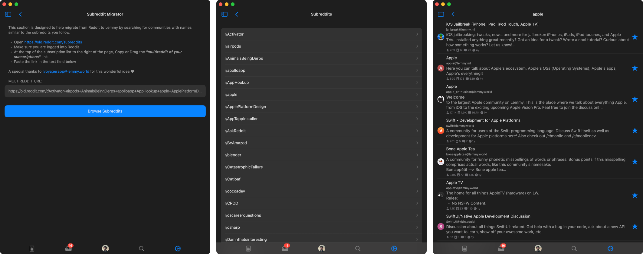
I’ve finished up the reddit migrator for Arctic. This will behave exactly like the migrator in Voyager. Voyager did this vey well and I did not see much room for improvement. I made sure to give credit to Voyager for the feature idea.
I did experiment with loading reddit info to display in the feed such as subreddit icons, and subreddit descriptions and this worked, but it looks like reddit rate limits quite aggressively, so I could not include this in tool.
On a side not, these screenshots are from Arctic for MacOS which should be coming out next month if all goes well!
Great feedback. I’ve already implemented a way to disable swipe gestures which will be included in the next release. This is something I added the other day to improve the navigation on MacOS, but I’ll also include it in the iOS builds.
The double tap/long press for voting is a good idea, I’ll look into adding this as an option to the gesture settings.
Adding a subreddit migrator should be very easy to implement. I’ve already implemented the Lemmy Explorer api, which should streamline the migrator. I could probably come up with a working migrator tomorrow morning.
If you’re the developer of this app, then I would like to clearly state myself directly:
- Don’t get me wrong, side gestures should actually exist but it’s overly if not weirdly misused in Lemmy. Side Gestures should be strictly utilised to quickly enter (right swipe) and exit (left swipe) communities, posts, threads or menus including in settings by default instead of having to tap some corner of the screen. Side Gestures can also be used to switch between All-Hot-New in the homescreen where I prefer Voyager for thinking this through in the ‘Posts’ section.
- Double-Tap should be utilised to upvote, Long-Press to collapse, Haptic Touch to show the expanded menu items instead of accidentally triggering something random every time.
- ‘Save’ followed by ‘Share’ should have a dedicated button to the right under posts while the ‘voting’ and ‘comment’ button on the left need to become larger instead of having a case of ants vs elephants for the same function.
↑420 ↓69 <gap> 💬 <gap> ✓ ↻
- The ••• menu for each post shouldn’t then display the same repeated options like the voting buttons for the third time after the above implementations and instead should focus on highlighting the essentials with focused minimalism like save media for example.
- Comment threads are really hard to follow on Lemmy, the colours are a nice touch that may even evolve to change with lighter shades but replies under main comments need to stay single like reddit with lines guiding them. Having the same card layout for comments, replies, subreplies… for the entire thread is a chaotic disaster. This goes same with posts where it’s difficult to gather where the screenshot ends and the caption begins especially when the attachments here are also weird.
- The display of user thumbnails would be really appreciated in the comments thread so not only it has some life but it’s easier to identify individual participants without being forced to read each meaningless to complex random usernames while scrolling.
- It’s been also observed that one can’t create or manage communities from the Lemmy client as opposed to Apollo which became moderator’s favourite Reddit client.
A personal observation: Default theme colour shouldn’t be sleep inducing bland blue but something warmer even if red to reddit’s orange. Skype, Facebook, Twitter to AIM all started with that particular shade of blue which didn’t have OLED darkmode back then; it’s advisable to not start with grey-blue combo to red-black by default for all age group going in this era.
Yes I am the developer of Arctic, thank you for taking the time to write out your thoughts. I’ll do my best to respond to all your feedback here.
- Swipe Gesture: when I mentioned a new feature to disable swipe gestures I was only referring to swipe actions on cells, eg. (upvote, downvote, reply, share, etc) swipe navigation is still enabled when disabling swipe actions. However with swipe actions enabled, you can still use swipe gestures to navigate the app, you just have to start your swipe at the edge of the screen just like navigation in the Mail app for instance. With that said, based on this feedback I added a new setting to enable full-screen navigation gestures, with this you can swipe left or right to go forward or back from anywhere on the screen. This is not a default iOS navigation gesture which is why I did not opt to include this from the start.
- Tap Gestures: This one I am unsure about, double tap to upvote makes sense, however Long Press, and Haptic Touch are the same thing on most devices now that Force Touch was removed from new devices, and there would be no good way to handle both on the same view. I’m not sure I understand what you mean by triggering something random every time? Do you mean swipe gestures are random?
- Post Footers: currently the information on the bottom left of the posts is just statistics label, its meant as an overview of the post contents, not as an interactive element, that is why the label is small, since interaction is not intended. As for the vote buttons to the right, I could definitely make the configurable like the swipe actions so you could configure their actions. I’d prefer not to use the left information label as buttons, but I can look into adding more customization to this footer view as a whole.
- The ••• menu: This is something I may be able to improve. I’ve opted to show repeated options like voting so the menu is consistent throughout the app. Users can change the swipe actions, and disable vote buttons, etc. so this menu may be the only place with those options left available, and I wanted that to be consistent in post feeds, open posts, comments, etc.
- Comment Threads: This is something that definitely has room for improvement. I am working on adding profile pictures which should help improve following conversations. I do not want to differentiate between comments, replies, subreplies, etc. These are all just comments whether it is a reply to the post or a parent comment. I do plan to add support for continuous lines to the left to make it easier to follow comment depth, However the current layout is basically the standard as far as comment feeds are handled in most other apps I’ve used with comment chains.
- Comment Profile Pictures: I mentioned this above, but this is something I am working on adding, I’ll hopefully have this included in the next update.
- Creating and Managing Communities: This is a feature already, Though I may need to improve its visibility. For editing a community you moderate, you can open the ••• menu at the top of the screen when viewing a community feed and select Edit Community. Here you can edit the community metadata and settings. For managing user reports, you can open the same menu and open the Mod Zone (only available if you moderate at least one community) which is available in the profile tab, or the subscriptions list view. For creating communities, currently this is only available in the profile tab under the ••• menu, but I will also be adding this to the subscriptions feed for better visibility.
- Default Tint Color: This one is something that won’t be changing. Arctic is modeled to behave and appear like a system app on iOS, most system apps use a default tint color of blue. Additionally, Arctic’s logo is primarily blue and this fits with Arctic’s branding. Blue is also a calming color with great contrast and legibility with both light and dark backgrounds. In designing Arctic, my primary influences were Apollo, and the system Mail app, both of which use the default system blue for the tint color. However, if you do not care for the default tint, you can always change it in Arctic’s Appearance settings. I am also in the process of adding full theming support for Arctic so you can customize the color scheme of basically every element in the app, and save multiple themes.
All of this is open to discussion, I’m always happy to add new features and improve Arctic. On that note, I did finish up the Reddit Migrator yesterday. The new migrator works almost exactly the same as the migrator in Voyager, It was done very well there and I did not see much room for improvement.
Thank you for all the feedback, it is always welcome!
[edit] I just finished number 6, comments will now display user avatar pictures. Users can enable or disable this feature in settings
I’m beginning to think this app is abandoned, man. I don’t expect any features to be added. TestFlight version hasn’t been updated in 2 and a half months.
It’s not dead. I’ve been very busy and have not had the time to work on it recently. I’ve started working on the next update, and I nearly have it ready for the next TestFlight release. I have a dozen or so bugs patched and a few new features done. I’m also hoping to finish up theming support before the next release.
Next month I should have the time to finish up, and release the MacOS build I’ve been working on, along with improved iPad support.
Things should start moving here again. I’m hoping to get back to weekly updates here soon.
I like the smoothness and animations from being built natively but these tiny-tiny annoyances everywhere are also irritating at the same time like with swipe gestures mentioned above that can be double-tap and long press instead or the notifications for example doesn’t reset nor receive them at real time and so on…
I keep forgetting to enable clearing notifications when reading them in app. I added this feature, but had it disabled for testing. Thank you for reminding me.
As for real-time notification, this is just not possible yet due to API limitations. If they add support for web hooks in the future, then I will add real-time notifications. But currently the only way to get notifications is to request them from the instance. Im already fetching notifications once a minute for each account with notifications enabled. This translates to a lot of network traffic for instances, and I do not want to increase that beyond what it is currently.