Huh? In the exact same place on this Pixel and my last three Pixels is the Power button, Double tapping the Power Button on my Android phone opens the camera. Press and hold to talk to Assistant. Hold a long time to open Emergency and eventually call 911 automatically. It's been a option for a long time. It would be nice if Google made these use assignable actions but they already exist.
The power button on my wife's old phone (Pixel 3, I think) started to flip it's shit and we got woken up by police knocking on our door because of it one time.
This is what I don't get. Well obviously they want to push usage of their own services, but shortcut stuff like this should always be customisable. To a degree I even understand it for assistant, but why would you want to push the usage stats of the camera app? Android has been about choice for such a long time, but they have been fucking this up for so many years now, letting Apple get the points here.
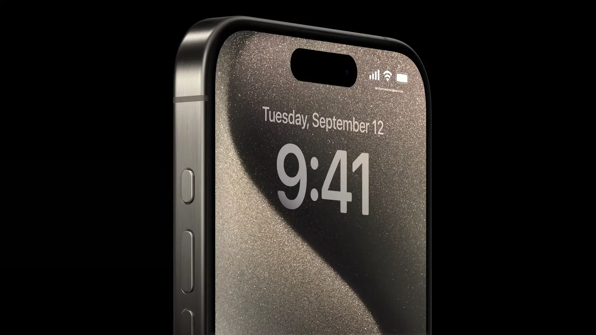
I know basically nothing about the Action Button, but fwiw, iPhones use the power button in a similar manner already. Double press opens Apple Pay, press and hold for Siri.
Samsung and Google were literally ahead with a Bixby button and the Edge Squeeze. Too bad they didn't make it more functional than just an assistant macro. I had a rooted 2 XL and I still miss squeeze for flashlight.
I always was sad to see people bashing the Bixby buttons existence. I never used Bixby ever but it was so useful as a macro button. Now they took the button away.
On my s22+ you can double tap the power button to open up the camera or any app that you'd like automatically.
Motorola shake flashlight was the best. Just a quick chop chop and you'd have a light
I now have a little flashlight button on my lock screen I can slide to turn on the flashlight. Not as convenient but way better than not having it there.
Actually youre right on the moto gesture. I used to have droid turbo and the only reason I rooted my 2 XL in the first place was because I missed chop chop. Double twist for camera was also great.
The Bixby button sucked because for so long you couldn't remap it to do anything else. And even when they finally relented at the end, they only allowed it to have the functions of press and hold or double tap to activate extra features, but single tap was always still reserved for Bixby.
Having a dedicated mute button is good when your default volume controls are for media volume. Not that it makes a difference for me because my phone is forever on vibrate, but I get the utility.
I have a Note 8, they've now had it for a while where you can single tap to open an app or run a command. But if you choose to do that, double press opens Bixby. So sadly you get Bixby no matter what.
I'm pretty sure that you could customise a single press of the Bixby button however you could only ever customise either the single or the double press and the other one would have to be mapped to Bixby
The mute toggle on iPhone doesn’t mute media if you play something with it enabled, and you can still increase/decrease the volume of that, you just don’t get any notification sounds. So bit different than just turning the volume down for the whole device.
I keep mute enabled all the time because I get the notifications on my watch, and I forget it’s on because media still plays with sound. It’s actually really nice. One of the few things I actually like about iPhone.
This volume button pair is actually configurable on my phone, that's why I brought it up. I can choose whether the buttons affect notifications or media by default, and when media is playing it'll always change the media volume.
Yeah, it wasn't used much so they removed it ig. But its apple so now its new and innovative and everything needs it! ffs
Gimme expandable storage and 3.5mm ports back first.
Yeah, just have a Motorola😝 I mean it's in lineage on my old Motorola, anyway I have an OnePlus phone now and miss it dearly, this and twist for camera, changing songs by holding volume buttons etc
Man this so much!! I switched to a Galaxy (because it was part of the free deal with the phone network) from my Motorola and was baffled it wasn't a default Android feature. It was easily one of the top 5 handiest features. I know I can't get a third party app that can still do the that but it's just not the same knowing how spot on and nifty Motorola did.
My S23 Ultra does this now. It no longer has the bixby button, but the power button can be remapped. I have it now so that double clicking the power button opens my camera app, but long pressing it shuts off my phone.
I'd still like an extra button and/or squeeze function like the early pixels had. The big thing for me on the ultra while you're in the camera app would be a shutter button like some of Sony Xperia phones have. Being able to double tap the shutter button for the camera could open the power button to open another app or function, also wouldn't mind seeing a triple tap function added to the button as well.
Many Android phones already have had buttons and more. My phone has an assistant button which I wish would become a shutter button when I open the camera, and do something else when I double tap. But it's not programmable sadly.
Now that Apple has done it, maybe it will make a comeback on Android...
At least I have really useful ports like a headphone jack and SD card slot. iPhone doesn't have that yet.... Lol
Headphone jack and sd card slot? You must have an old phone, wait till you buy a new one lol. It's annoying af how many manufacturers have removed this
I bought it new actually. Last December. Sony Xperia 10iii. In the meantime the 10v just came out a month ago.
I specifically bought Sony because it has a headphone jack and SD card slot.
But I know what you mean. It's so hard to find anything above €450 the has a headphone jack. Only the Sony Xperia's and the Asus ZenFone as far as I'm aware.
Samsung XCover's have that button. I have never used it for anything and just disabled it as it was just annoying. That little mute switch that apples have though is fantastic used that all the time, when I had an iPhone for work.
My Samsung Galaxy S10 has already:
The bixby button which opens my calendar (no root necessary)
The powerbutton pressed twice: opens the camera.
The volume down button: takes a picture.
iPhone once more is just missing options and settings
Any time I’ve switched to android over the years that little switch is one of the biggest, yet smallest features on the iPhone that I end up really missing. It is so convenient, and now that it’s reprogrammable with different taps it will be even better.
It will be the think I probably miss the most when I eventually upgrade. The brilliance of the switch is that it is a switch - which means can be verified by feel or by sight to be in the silent position without needing to wake or even take you phone out of your pocket.
I never liked the physical switch because I would switch it on accident. I want my phone on vibrate 99.9% of the time, so the switch is kind of wasted space, which is why I like the idea of the programmable button better than the switch.
Android actually improved their silent/vibrate/ring switching a couple of years ago. You no longer need to go into the settings or even the quick settings. You just press one of the volume buttons, and a little pop-up comes up showing your volume level. On that pop-up, there's a button to toggle the silent/vibrate/ring state. I think it's easy enough, but you do need to have your screen on, which I could see defeating the purpose for people who use that feature a lot.
They ditched the alert slider? When? I'm on a OnePlus 6, and have been considering installing LineageOS on it to give it a few more years of life. The alert slider is one of the reasons why I don't want to give it up just yet.
No, they still have the alert slider. It wasn't on the OnePlus 10, but they brought it back on the 11 and it looks like it will be included on the upcoming 12.
The slider was probably the feature that I liked least about my OnePlus phones, and it was actually a factor in me deciding to not get a OnePlus phone again. Unlike the iPhone switch, which had an action that was perpendicular to the direction that my phone was moving when putting it into my pocket, the OnePlus phone's slider was parallel to that movement. So the slider would change positions every time my phone would go into my pocket. I like my phone on vibrate 99.9% of the time, so I always needed it in the middle position, which was the hardest one to get it into. I always found myself wishing I could disable that feature, but I never found a way to.
Reminds me of this thing I bought a long time ago, back when phones still had headphone jacks. It was a button that plugged into that, and you could program it to do whatever you wanted. It was neat, but often didn't work too well. I wish I could remember what it was called.
Anyway, Pixels have the feature where you can tap the back of the phone and map that to an action, so we already kind of have that. Mine is mapped to the flashlight.
My Pixel 7a nearly has this. The "Power" button by default does:
Short Press: Sleep/Wake
Long Press: Assistant
In order to actually get the power menu to pop up, you hold the power button + volume up. You can switch the behavior so that a long press can either be the assistant or the power menu, but otherwise not fully configurable. Feels like that would be an easy win to let us do whatever we want with it.
I can't remember the button combo, but there's a way to use the power and volume buttons to switch between silent and back. I used to hit it all the time by accident.
The same one they mentioned, if the power button is set to assistant then it brings up the power menu and if the power button is set to the power menu then it sets the phone to silent/vibrate, but doesn't switch it back.
The author is under the impression that the button will be infinitely remappable. Given Apple's history, I expect it to be rather limited. I will sorely miss the mute switch which has both a tactile and visible position indicator which does not require waking the phone, or even having the phone on, to actuate (should you want to turn on your phone without getting bombarded with notification sounds).
I see a lot of people mentioning a mute switch...is that anything other than what it sounds like it does? Cus I've had volume buttons since the old Nokia brick days.
Unpopular opinion, but phones these days don't really need more buttons, but less. We have a huge touch screen after all, let's take better advantage of it!
"Action button" - Android phones have had a long press of power button be the assistant button since Android 12, just set your "assistant" as whatever action you want (e.g. with Tasker).
Sleep/wake button - can be the power button for now, but also don't forget double-tap on the home screen/lock screen/status bar.
Power off/on - virtual button since Android 12, physical button for turning on. In case of emergency, I guess hold down for longer or do something like triple-tap.
Volume keys - every video app should use onscreen gestures, same could be applied for music. In other contexts, statusbar or side swiping gesture could suffice, plus a notification shade slider like some OEMs already provide.
Honestly on screen gesture controls suck ass. Also its pretty dumb for the solution to be "remap your power/volume button." An obvious problem that touch screens lack (for the moment) is tactile feel.