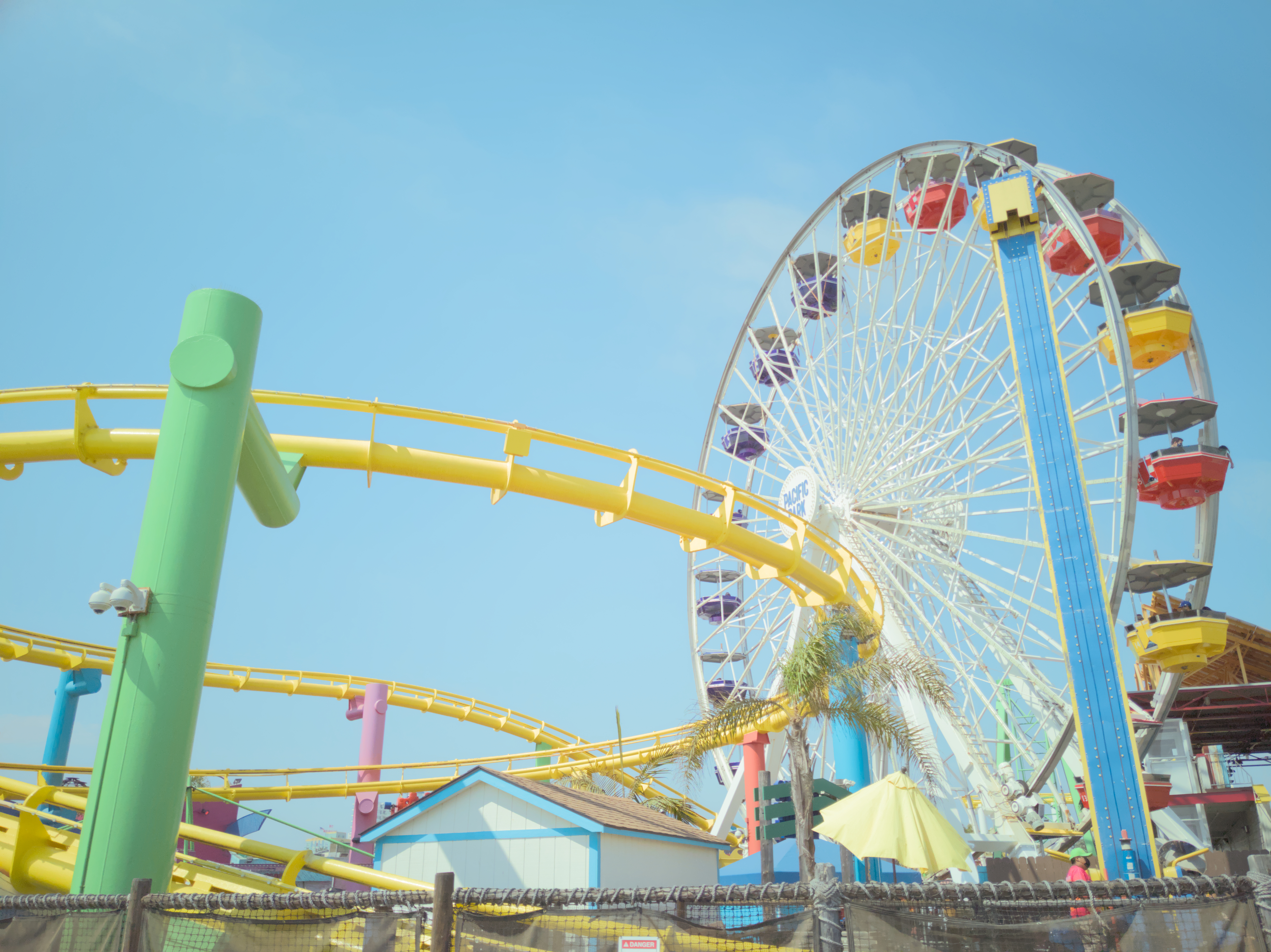
Darktable: Pastel Style
Darktable: Pastel Style


Another darktable text tutorial! I know darktable has a reputation for being intimidating, but it's really powerful software and you can get a lot done with very few modules.
Darktable: Pastel Style


Another darktable text tutorial! I know darktable has a reputation for being intimidating, but it's really powerful software and you can get a lot done with very few modules.
Very lovely, thank you for your awesome guide! I wanna see way more of those kinds, very helpful and straight to the point.
I already developed this exact style by accident and I'm using it most of the time for my pics.
I have a 1/4 or 1/2 black mist filter strapped on and do following post-processing steps:
Here are a few recent examples:
Thanks for sharing your steps! How do you decide if you should increase or decrease the strongest color?
Depends on the mood I want to archive.
If it should look a bit dreamy or special, then I increase the blue of the sky/ the orange of a sunset/ the tone of the subject for example. See photo 1 and 2.
Normally, I don't amplify specific colours by default, because I have a CVD and then the pic looks very artificial. It's more of a special style element that's used when needed, but not otherwise.
If I want to let the viewer to look at the "contrast", which I already decreased by a lot, to let patterns or objects pop out more, or give the pic a "depressing" mood, then I decrease the brilliance of one tone. See photo 2
Picture 1: It still looks "wintery and sad", but the green of the twig is amplified. If the greens wouldn't be re-compensated, the whole pic would almost be black and white.
Pic 2: here I increased the purples a bit and amplified the shadows to fetch the mood and focus of the sunrise
Picture 3: still not much contrast, but the almost black&white-look and increased shadows put the focus onto the ice crystals instead of the interior of the barn.
In that way, I can artificially set more contrast, even if I reduced it before.