Then let's do some inane arguing!
It all depends on your color model. If you would use CMYK instead you would see that burgundy is a combination of magenta, yellow and black, just as brown is.
The definition of brown can definitely include blue as well, e.g. W3C defines the keyword brown as rgb(165, 42, 42).
I think it's more about where you draw the line between red and brown, which is individual and cultural. Apparently, my view on this might be a bit controversial. I first saw the old Georgian flag as a small child that did not know fancy words like "burgundy" and "maroon". It seemed brown to me, and so it has remained in my mind, even if it would be more exact to describe it as some nuance brownish shade of red, or reddish shade of brown.
You can also have a look at the Wikipedia page with shades of brown, and I'm sure you will find that people can be way crazier than me when it comes to describing things as brown. Like, how can wheat, bone, moles or black olives be brown?
The current flag dates back to the middle ages, maybe as far as the 12th century. This makes it not only one of the youngest national flags of the world (since 2004), but also one of the oldest! (Even if it has been in disuse for most of its history.)
The red cross on white background comes from the flag of the late antique Kingdom of Iberia (located in present day Georgia and unrelated to the Iberian Peninsula). The four crosses are Bolnisi crosses, a Georgian national symbol, taken from an ornament found in the 5th century Bolnisi Sioni church.
Also check out their quite different naval ensign:
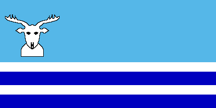
I found the flag on Wikipedia, but I cannot find any reliable sources verifying that it is actually used or officially adopted by somebody. So take it with a pinch of salt.
Anyway, there is an official flag of the Evenk Autonomous Okrug looking like this:
But I like the flag in the main image better, so that's why its the main image. And even if it might not be true, it is still a nice flag.
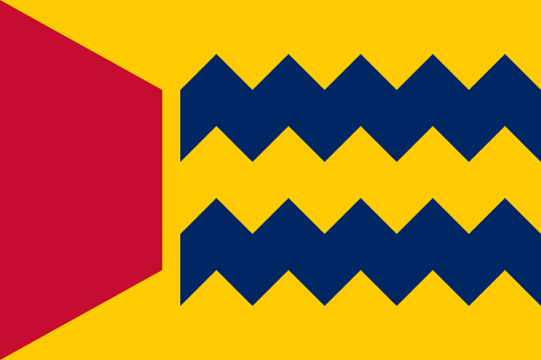
FOTW also lists this possible flag, that I'm not as impressed by:
Jämtland does not want to play with the other boring kids anyway. They consider themselves an independent republic standing above puny provincial flags. Because the flag was created for the Republic Jamtland, it looks different than all other provincial flags.
The provinces of Sweden are historical and cultural regions. Today, they no longer have any administrative function, but still serve as a basis of cultural identification.
The provinces do not have officially approved flags, but still flags have been created for some provinces and are in unofficial use.
The provinces do have coat of arms, and sometimes they are made into flags:
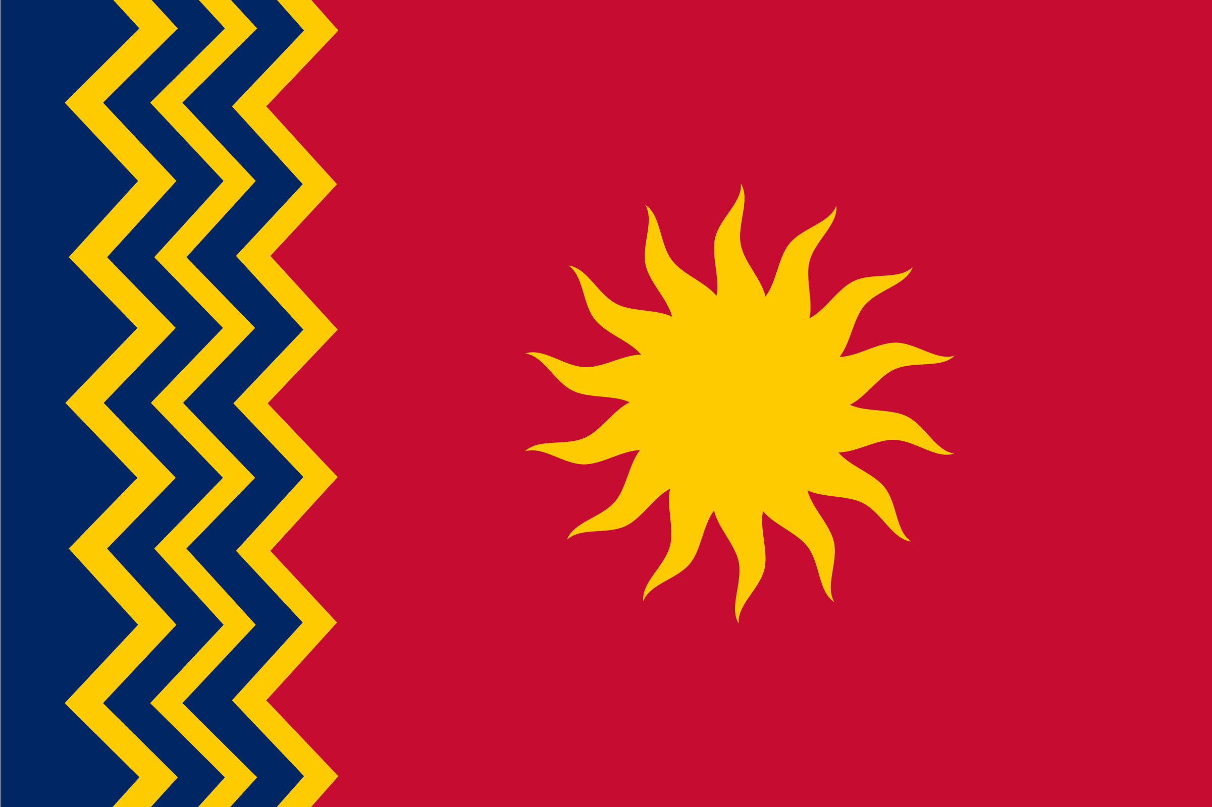
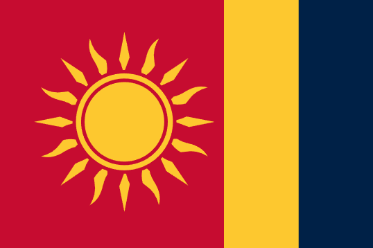
Version 1 IMO. No need to add features to an already nice sun. Any background on the design?
In my opinion a triangle generally looks better, but the trapezoid flags definitely gets points for distinctness, which shouldn't be underestimated.
These two are probably my favourites:


Not to much a fan of swirly designs like this, looks too much like a logo and not so much like a flag:

But mostly, I'm disappointed that my laser loon flag did not qualify as a finalist:

Nice work! So much better than the existing flags, both the design and the well thought symbolism. Though Puerto Rico's flag hardly needs changing IMO, it is already great as it is.
The AK-47 and hoe of the Mozambican flag can also be seen as a version of the hammer and sickle, else the symbol is no longer used on national flags today.
The Angolan flag is derived from the flag of the ruling party MPLA, which led Angola to independence from Portugal:
Since MPLA won the Angolan Civil War, this flag has remained, although there have been plans to change the flag to something less politically loaded. This is a proposal:
If the winner of the civil war would have been UNITA or FNLA instead, maybe the Angolan flag would like one of their flags.
Flag of UNITA:
Flag of FNLA, which looks quite nice IMO:
Symbolism mainly taken from the coat of arms:
Some other redesigns:
From HansLN
From Reddit user u/imagiflaggi:
From Reddit user u/DerCriado:
From Reddit user u/Eunaotenhoesmola:
(Since you almost need a magnifying glass to see the small purple fields in the rainbows of the flags of El Salvador and Nicaragua, I think they barely count.)
The original flag from 1978 had the sisserou parrot looking the other direction, and a different color order in the cross:
The current flag dates from 1990 (apparently also adopted November 3).
(Or rather most complex, excluding flags with complex CoA.)
The large star in the middle represents the island of Niue, the four smaller stars represent the Southern Cross.
Alternative colors:
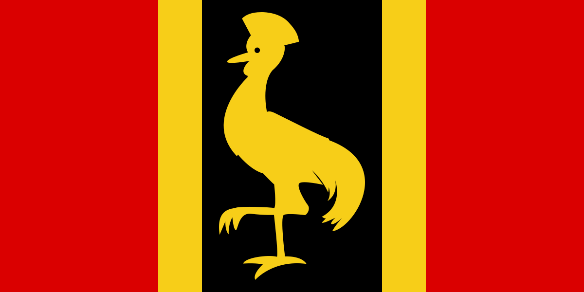
It is based on the provisional flag of Uganda, used on the eve of independence in 1962:
I liked how the crane was more prominent, and not just an indistinguishable spot in the middle. However, I still preferred the colors of the current Ugandan flag.
The solution seemed easy enough: combining the two!
Info about the process and the proposals: https://www.fotw.info/flags/fj!.html
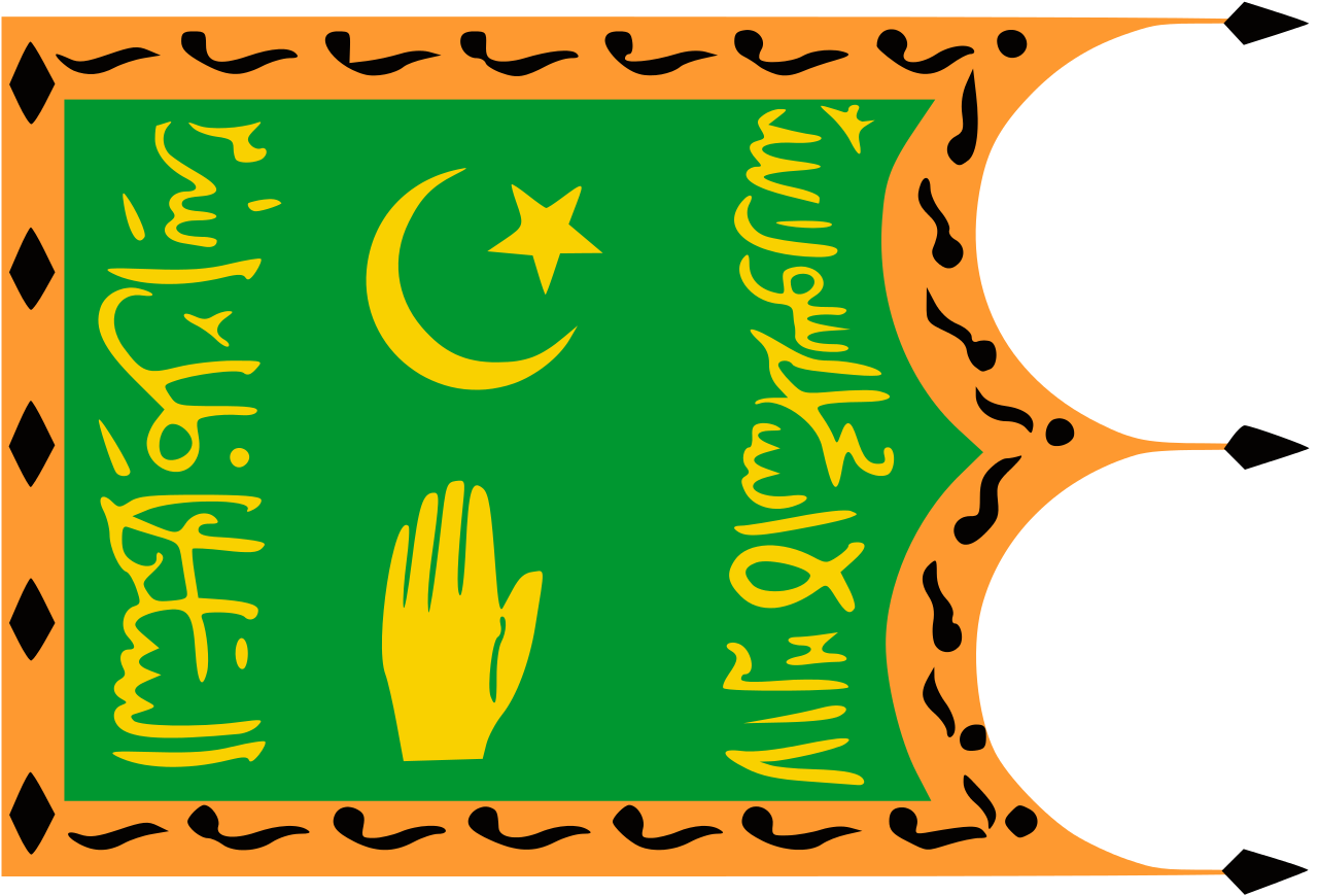
This is a quite obscure flag that little is known about. I can't even say that it is rotated the correct way and shouldn't be lying down instead. However, I couldn't help but opt for the funnier rotation.
The flag was possibly not in widespread use, or only used briefly. The more commonly cited flag of the Buchara Emirate looks like this:
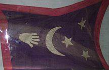
The only source seems to be that some guy named Ivan Sache's parents saw this flag in a museum Buchara. There was no caption, so it's uncertain how this flag was used, or even how it should be rotated. There is a low-quality picture showing it displayed horizontally:
However, it does not seem implausible that the hand of Fatima would point upwards, as it normally does. If there is no red border at the bottom, which cannot be seen, it would seem logical that that would be the hoist side. And not the least, it would definitely be more amusing if the flag was rotated this way.
https://www.crwflags.com/fotw/flags/uz-bu.html
There does not seem to be an officially defined shade of blue, but a bright blue is seen in for example these pictures of prime ministers:
Many do believe that it should be dark blue though, as shown by a quick ducking. On Wikipedia, there seems to be an ongoing edit war about it.
Then there is the color of the feathers, that allegedly where changed from blue to grey in 2011, but sources are not 100% reliable.
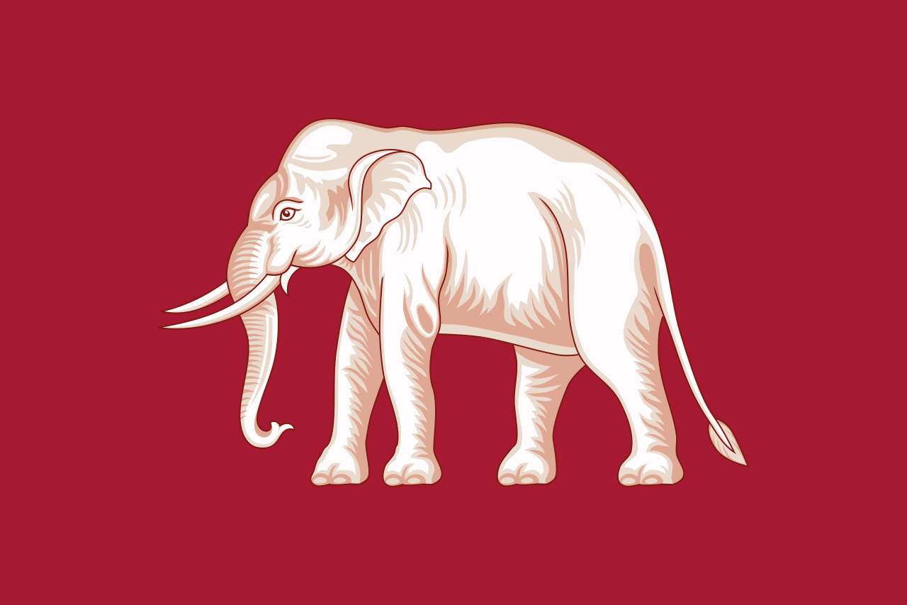
Back before the current flag, Siam used a red flag with a white elephant:
Legend has it that the king, to his horror, encountered one of these flags upside-down, and to avoid that from happening again, decided to change to a flag that could not be turned upside-down. As a consequence, the following flag was adopted in 1916:
As you can see, the blue field was red back then. Allegedly it was changed to blue to show allegiance to the Entente powers during WWI, since they had blue-white-red flags. Alternatively, blue was associated with Friday, the weekday the king was born. Or alternative to that, blue just made the flag a lot prettier (which it indeed does).
Well, many of the flags of the Soviet Republics were basically the same as well. And of course many of the US state flags (SOB). The similarity might simply be due to laziness, but it is quite realistic as well.
Reminds me of this proposed flag of Kuwait from 1906.

Nice and well thought out flag! It ticks all boxes for a good design.
I think I prefer this to the most famous keystone proposal. Putting the keystones in the middle make them more clearly look like keystones, rather than just a strange middle field. Matching William Penn's coat of arms is also a nice bonus.
Popular "keystone" proposal for reference:

No idea why it's a gif. I just linked to it from that webpage. It doesn't display a play symbol in the browser. But it is a good call from you, showing why it's better to avoid gifs for static image. Nevertheless, the position of the play symbol is quite pleasing.
Strange flag for a strange country. The whole story and the person D'Annunzio are quite unique and fascinating.
Glad to see this series here! I hope you keep posting!
Regarding the Cabinda flag, it seems to me that the color combination is not working too well. Maybe because its not very "vexillogical" colors? Yet, orange and blue are supposed to work well together, but maybe the yellow in between ruins the effect?
Yeah, I agree. I also prefer the version where they did not change the green or the bending of the crescent. Apparently that was the initially presented proposal.

