Thank you for developing this! Ask someone who uses Lemmy on their tablet this could be a great fit.
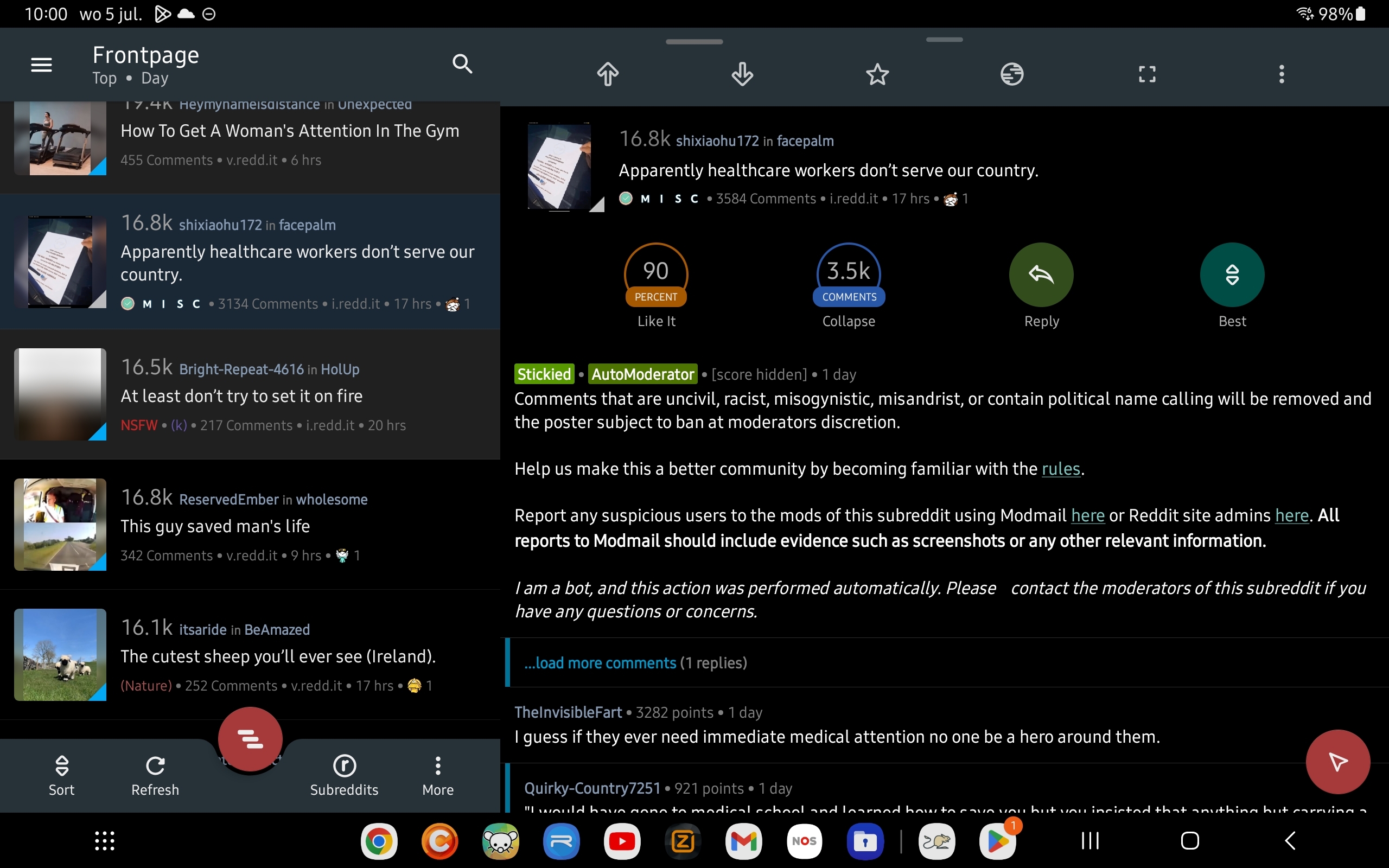
It would be awesome if the list of posts could be fixed on the left side and then the right part of the screen for the content of the selected post. The overlay is a good step in the right direction, but the link is quite small to tap correctly.
Below is a screenshot of my Reddit client, because a picture says more than a thousand words:

Thanks again!
I'm using my tablet to browse Lemmy and haven't found an app yet that has all the posts on the left side and the content of a single post on the right.
The screenshot shows an example.
Also, mark a post as read when you have opened the media and ability to hide read posts.

Absolutely not! I started at 29 next to my it job, best decision ever. Tough though, already had a kid and 2nd one was born during.
Absolutely not! I started at 25 next to my it job, best decision ever. Tough though, already had a kid and 2nd one was born during.