Lol. I'm not worried about the pinkos, they have no backbone.
I'm also in no way a professional writer.
I have one. It also sucks to ride for an hour, you're eaither sweating, freezing or some other form of uncomfortable.
If you're really interested...
Let's say you want to know how an ad has affected your sales since it was released 3 months ago.
You could put every single sale as a dot on a graph, but it probably wouldn't mean anything. Even if it showed the dots gradually getting higher on the chart. Was that caused by the ad or does it happen every year at the se time? What other factors could have caused this.
So I'll pause right there and say you will never know. You will never know all the forces that affect trends. You can get relatively close, but not. Does weather affect your sales? Delivery time? Internet sentiment?
So that's not very scientific, right? You need to know and control all variables to test an outcome.
Anyway, so you have a graph with dots and it may or may not mean anything. You think, ok what was last year's sales during these same 3 months?
So you get last year's data and plot the sales as dots in a different color. Now you have a graph with a ton of dots of two colors, and best case scenario: the dots for this year are higher than last year.
Is it responsible to stop there? If it were me, and my money, I'd want to make sure. So then you'd compare data from two years ago. Now you have a chart with three colors of dots.
Again, best case, this year is higher than that year too. However, as always is the case, the dots are getting difficult to understand, especially for people that don't know anything about data. You need to make things simple to digest.
So you say "I'll make an average of each month" and that will show how the averages are getting bigger, compared to previous years. Great!
So you average all the dots by month and plot them on a graph, and it looks great. But there are a few months that don't prove what you saw in the raw data. For instance, one month, two years ago, you landed a big contract and sold an astronomical number of units. So that month is the biggest one of all.
Ofuck.jpeg
Ok, no problem, you'll just remove those two data points, because they are skewing the day. Again, this is best case. Most of the time you will not be sure if these data points are errors in the data or Genuine sales. But anyway...
Luckily there is a method for removing "outliers" it's called standard deviation, and it's basically an equation that figures out what is an acceptable outlier and what isn't.
Again, I'll pause here to point out how unscientific this is. You are removing data because it doesn't follow the trend you want to show. And this is a perfectly acceptable practice in data analytics. And I'll point out something else, what was the affect of those contracts on your normal business sales? Did you make relatively less sales because of it? Is it responsible to completely remove those sales? Is it ethical?
And this is all very minor stuff in analytics. The more detailed the question, the more the data is "cleansed" by equations that get progressively more complicated - the more ethically vague the data is.
How about this weather?
Don't underestimate small talk. It lets people take their wall down.
Data analyst here. It really do be like that. You can use stats to prove anything.
Yfw they say data doesn't lie. Looool
Yeah, I'm not going to spend 6 hours driving a bicycle to work and back.
I am that uncle. I'm just doing what I have to to survive.
If I could buy a new car I would. I'd get an electric, self-driving pleasure machine, but no way I can afford it.
Maybe when this thing breaks down (it's already 15 yrs old).
A $200k horror movie that can be out in 3 months. It's about a serial killer who steals the teeth from his victims.
My script mixes highly defined characters, supernatural cosmic horror, and old world body horror. It's goes off the rails in terrifying and fun ways.
Ps: I actually have a script ready to go and have no hangups about scabbing.
I think op hasn't heard of web components. Technically it requires js, but still it will replace react and angular and vue soon me thinks.
Reddit has actually gotten a lot better since the Exodus. All the political activists have come here.
Right. Magically, everyone on the Internet has become infatuated with communism out of thin air over the last few years. Must just be my paranoia to surggest influence from a hostile government.
Lemmy is whatever we make it, except for the communism posts that love communism until they realize workers need representation. I half believe those are Chinese bots or high school kids who are stupid enough to believe the Chinese bots.
Works out for me, cheesy Xmas movies are a treasure. Plus, if they're Hallmark, oh fuck, that's good.
Is there an English version?
Yeah, fuck that. English is bs enough.
Edit: yeah, that "feeling" is knowing it so well, you don't totally understand it, and also means it's hard to convey
This is giving me stress daymares about Spanish in high school.
Still, it's an interesting point you make.
But then again, with definitive articles you have a bunch of things that are not supposed to convey gender conveying gender. Like a toaster... It would suck to have to remember the gender of a toaster, or, well toasters in general.
That's a bummer. The first season was good... Except that bottle episode... Can TV just stop doing bottle episodes?
Paul Sérusier sojourned in Pont-Aven during the summer of 1888, as Paul Gauguin, whose advice he followed. On his returning to Paris, he showed his young fellow painters, the future "Nabis" ("prophets" in Hebrew), what was to become their "Talisman". A close observation of the painting allows one to recognise certain elements of the landscape represented : the wood, at the top on the left, the transversal path, the row of beech trees on the river bank, and the mill, at the back, on the right. Each of these elements is a stain of colour. According to Maurice Denis, Gauguin had told Séruzier : "How do you see these trees? They are yellow. So, put in yellow; this shadow, rather blue, paint it with pure ultramarine; these red leaves? Put in vermilion". Although they were determined that visual sensation should prevail over the intellectual perception of the world, the impressionists had not given up a conception of painting implying the representation of what they observed. Here the mimetic conception is thoroughly replaced by the search for a coloured equivalent. Maurice Denis explained that in front of this landscape, he and his friends felt "liberated from all the yokes that the idea of copying brought to [our] painters' instincts". Posterity was to see - in retrospect – in this painting the manifesto of a pure painting, autonomous and abstract, related to Maurice Denis's famous statement: "Remember that a painting, before being a battle horse, a nude woman or any anecdote, is essentially a plane surface covered with colours assembled in a certain order.", that was not published before... 1914, in Theories...
https://www.musee-orsay.fr/en/artworks/le-talisman-paysage-au-bois-damour-8028
Jan Toorop, born in Java in 1858 when it was still a Dutch colony, soon came to Europe and studied at the Amsterdam Academy from 1881 before continuing his studies in Brussels, Paris and London. Receptive to the many aesthetic currents then running through Europe, he soon gave up Naturalism for Neo-Impressionism, before devoting a few short years to Symbolism. 1893, the year of this astonishing pastel, which was designed as a project for a stained-glass window, was the peak of his participation in the Symbolist movement. The iconography, which originally continued over the frame, is highly complex: the female face with wide-open eyes represents Desire, who is praying that the still closed lily might receive the white dew of the rain falling from the clouds above her. Behind the cross, seen from the back, which leaves only a part of Christ's crown of thorns visible, another face seen from the side with half-closed eyes is that of Satisfaction. The figure is holding a half-open lily into which the fertilising spiritual dew has already fallen, releasing its perfume. The linear environment is made up of a band of parallel lines winding through the composition; they represent sounds coming from the bell on the right which travel through the world supporting faith, a reminder, as Toroop said, of "the pure mystical periods of yesteryear". In 1911, the artist gave this echo of complex mysticism, highly critical of contemporary society, to Maurice Denis, a painter and poet with a clear, direct faith, in exchange for a Mother and Child now in the Kröller-Müller museum, Otterlo, in the Netherlands.
https://www.musee-orsay.fr/en/artworks/le-desir-et-lassouvissement-18468
After staying in the south of France, in Arles, and then at the psychiatric hospital in Saint-Rémy de Provence, Vincent Van Gogh settled in Auvers-sur-Oise, a village in the outskirts of Paris. His brother Théo, concerned with his health, incited him to see the Doctor Gachet, himself a painter and a friend of numerous artists, who accepted to treat him. During the two months separating his arrival, on May 21, 1890 and his death on July 29, the artist made about seventy paintings, over one per day, not to mention a large number of drawings. This is the only painting representing in full the church in Auvers that may sometimes be distinguished in the background of views of the whole village. This church, built in the 13th century in the early Gothic style, flanked by two Romanesque chapels, became under the painter's brush a flamboyant monument on the verge of dislocating itself from the ground and from the two paths that seem to be clasping it like torrents of lava or mud. If one compares this painting with Claude Monet's paintings of the cathedral in Rouen, painted shortly afterwards, one can measure how different Van Gogh's approach was from that of the impressionists. Unlike Monet, he did not try to render the impression of the play of light on the monument. Even though the church remains recognisable, the painting does not so much offer the spectator a faithful image of reality than a form of "expression" of a church. The artistic means used by Van Gogh anticipate the work of the fauvists and expressionist painters.
https://www.musee-orsay.fr/en/artworks/leglise-dauvers-sur-oise-vue-du-chevet-755
The London Houses of Parliament crop up regularly in Monet's work in 1900. At first the artist observed them from the terrace of St Thomas Hospital, on the opposite bank, near Westminster Bridge. Monet's London production, which includes views of Charing Cross bridge and Waterloo bridge, is in fact dominated by variations in the light and atmosphere due to the famous London fog, which enveloped the city, especially in autumn and winter. The unreal ghostly outline of Parliament buildings looms up like an apparition. The stone architecture seems to have lost its substance. Sky and water are painted in the same tones, dominated by mauve and orange. The brushstrokes are systematically broken into thousands of coloured patches to render the density of the atmosphere and the mist. Paradoxically, these impalpable elements become more tangible than the evanescent building which seems to dissolve in the shadow.
https://www.musee-orsay.fr/en/artworks/londres-le-parlement-trouee-de-soleil-dans-le-brouillard-1177
A realist painter who often depicted his native NYC, Dinnerstein was a precursor to Bo Bartlett's heavy-handed symbolism in the American Realist Movement.
This painting depicts a scene from central park. The view is from under the Bethesda Terrace looking at the Bethesda Fountain.
You can read more about the statue here: https://www.centralpark.com/things-to-do/attractions/bethesda-fountain/
It was named after a passage from the Bible (John:2-5) >Now there is at Jerusalem by the sheep market a pool, which is called... Bethesda... whoever then first after the troubling of the waters stepped in was made whole of whatsoever disease he had.
Dinnerstein's work often depicted spiritual subjects based on the Jewish faith. Perhaps there is some spiritual significance here, or perhaps Dinnerstein is exposing a side of NYC that is only seen by natives.
This is a view of the terrace from behind the statue:
This is a close-up of the statue:
Aside --
Consider listening to Chopan's Funeral March (you've heard it before, especially if you've played Castlevania). It is part of the inspiration for this work: https://www.youtube.com/watch?v=hZY5DBmgC_A&ab_channel=HDClassicalMusic
Syncretism -- A fashionable way to make art at the turn of the 19th century was to combine different arts together. Here, Podkowinski mixes art, music and poetry to paint this Nocturne. Chopan's Funeral March and a poem inspired by it (not great translated to English) were the driving force behind this painting.
Nocturnes -- Tone is supposed to take precidence over narrative in these works, popular at the time. The pallette, with restrictions to darker colors, takes mastery to get right.
Podkowinski -- This was the artist's last piece and is mentioned alongside Munch's Scream because of its tension and carrying signals of the demise of the painter. Before it was finished Podkowinski died from Tuberculosis.
One of the 200 Japanese wood carvings Manet collected in his lifetime. The introduction of Japanese art to the west had a huge impact, it is said to be the influence of the impressionist movement in france.
Openly mocked by the audience at the first Salon des Refuses in 1863, Whistler's vision of "art for art's sake" did not go over well at that time.
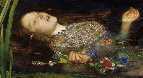
You can see influences of the Pre-Raphaelite brotherhood (emo kids of the 19th century art world) in this painting, and it is a great example of the transition from pre-raphaelite to impressionism. In it, Whistler paints a woman standing on some sort of ferocious animal rug.
The pre-raphaelites sought honesty, drama, and dedication beyond the main characters: a woman dressed in a simple white gown (depicting innocence perhaps), contrasting with the animal baring its teeth, so low in the picture, it's often overlooked. There are also flowers on the ground - real ones at her feet, and part of the carpet under the wolf rug. These are classic hallmarks of the brotherhood, who Whistler had become friendly with in London.
Pictured below is an example of pre-raphaelite ideals, similar to Whistler's painting: Dedication to details such as the flowers and the character holding a flower in her hand (Ophelia - Millais, 1851).
You can also see the definition fading. At certain parts of the picture - towards the bottom, you can see visible brush strokes almost as if the rug and wolf skin were moving.
However, impressionism is breaking away from pre-raphaelite ideals in the character: she is not doing anything special. The impressionists sought to show life as it is. The industrialization of Europe brought many changes, and the impressionists were dedicated to displaying these for all to see. This however, is a far cry from something like the pictured work below (Les Raboteurs de parquet - Caillebotte, 1875):
Where common people are depicted doing common tasks (unheardof in paintings at the time).
Benjamin Carbonne was born in 1970 in Saint-Martin d'Hères in the Isère. A self-taught artist, he starts making art at the age of 20 and gets to express the things that bother him, sometimes his own violence, that of the others or of the world and finally to make place in himself for something else.
The artist often represents tormented beings, he focuses on the faces that are sometimes soft and sensitive, but also tortured or distorted by pain, screaming, the need for expression. In 2004 he created with poet and painter Antonio Rodriguez Yuste the contemporary art studio "Interférences", later joined by Stéphane Carbonne (sculptor, painter, singer).
Some particular works are at the origin of the Carbonne's evolution: in 2007, the completion of a 50-meter long mural at the Rivesaltes camp gives new meaning to his approach and drives him to assert his "place" as an artist in history; in 2009 he gets a commission for a "Pieta" which will push him to experiment a different treatment of the body.
After having reached with great intensity the expression of what could be most alive and raw in himself and in humanity, Benjamin makes a shift that comes naturally, working on other bodies or faces, revealing all their power in a contrast of depths and lightness, of pictorial clarification and spaces of fantasy.
Saint-Martin d'Hères:
https://www.artsper.com/us/contemporary-artworks/painting/1354800/madone
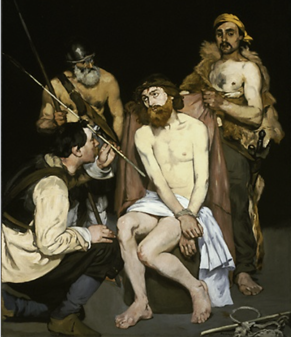
MANY PROGRESSIVE mid-nineteenth-century artists, including Gustave Courbet, felt it was dishonest to paint things that could not be observed at first hand: for example, angels with wings. In fact, "Religious painting has disappeared," pronounced one critic of the Salon of 1857. Not surprisingly, Manet's The Dead Christ, with Angels provoked both surprise and anger when it was exhibited at the Salon of 1864.
In the passage from the Gospel of John referred to in an inscription on a rock in Manet's painting, Christ's disciples entered his tomb and found no trace of his body there, but instead two angels at the head and feet of the shroud. Recently scholars have suggested that Manet included the dead body of Christ in his picture because he had been impressed by Ernest Renan's best-selling book La Vie de Jésus (1863), in which the author claimed that Christ was a man, not a supernatural being.
There are other anomalies in the painting: for example, Christ's wound is in his left side, and, though Baudelaire pointed out the mistake prior to the Salon, Manet did not correct it.
Nevertheless, criticism was not all adverse. Manet's advocates in the press compared his ability to paint the human figure to the skill of the Renaissance masters upon whose compositions The Dead Christ, with Angels is closely based.
Manet's previously exhibited works had frequently been found lacking in psychological characterization, but this Christ conveys both suffering and majesty, and the pity and sorrow of the angels are equally moving.
According to Antonin Proust, his lifelong friend, Manet always wanted to depict the Crucifixion. Although that project was never realized, The Dead Christ, with Angels and The Mocking of Christ (1865, Art Institute of Chicago) indicate what enormous expressive powers the painter could bring to religious subjects.
The Mocking of Christ - Manet (1865) !
Citation: Impressionist and post impressionist masterpieces from the national gallery of art p.32
Here's a summary I found online:
https://www.sothebys.com/en/auctions/ecatalogue/2003/19th-century-european-paintings-including-spanish-paintings-1850-1930-l03103/lot.221.html?locale=en
Charged with both exquisite grace and enormous power, La hora del baño combines some of Sorolla’s most potent images into a composition of epic proportions. The work ranks as one of his most complete and consummate compositions and is arguably the finest painting by the artist ever to be offered at auction.
Set on the beach at Valencia, the tender gesture of the young adolescent girl in the foreground and the innocence of the young boys frolicking in the surf, contrast with the tough masculinity of the oxen and riders beyond. The fresh breeze of the summer’s day is captured in the brilliant white sheet held up by the young girl and fills the sail of the ketch in the background. Shimmering on the water and glancing off the bodies of young and old, man and beast alike, light suffuses the whole. Yet La hora del baño is more than a contemporary depiction of the working men and innocent youth of Valencia in harmony with the elements. Sorolla’s spiralling composition of the young boys at play, the attentive pose of the adolescent girl and the fishermen at work beyond evokes the passing of generations and the rhythms of a timeless age that transcends the commonplace and imbues the painting with universal appeal.
Sorolla’s search for a visual vocabulary that he could make his own had occupied him since he had finished his formal training at the Spanish Academy in Rome in the late 1880s. During the 1890s he drew his inspiration from painting outdoors, in particular returning summer after summer to paint on the beach at Valencia where he had spent his childhood. His interest in local Valencian subjects had been reawakened during his first trip to Paris in the summer of 1885. There he visited the major retrospective of the work of Jules Bastien-Lepage who had died prematurely the preceding year at the age of 37. An advocate of Realism, Bastien-Lepage had led the call for painters to look again at rural themes for their subjects. The Frenchman's belief in the essential goodness of the humble worker and the importance of expressing a sense of place had much in common with Sorolla’s own belief in the intrinsic beauty to be found in everyday life (fig. 1). His first notable success in portraying the lives of the Valencian fishermen was La vuelta de la pesca (The Return from Fishing) of 1894 (fig. 2).
Sorolla’s pursuit of this ideal in the motif of fishermen at work, arguably reached its apogee in his monumental composition Sol de la tarde (Afternoon Sun), painted in 1903 (fig. 3) Thereafter, the oxen and fishermen, although still present, gradually became secondary to the main focus in his depiction of life on the beaches of Valencia. As a result, by the time Sorolla included the fishermen and oxen in La hora del baño a year later, their presence had been relegated to that of backdrop to the action of the children in the foreground. Describing his arrival at this point Sorolla recalled: ‘How long it has taken me to define this art. Twenty years! Up to the time I painted the picture which hangs in the Luxembourg [now Musée d’Orsay] the ideal I was pursuing was not revealed to me in its entirety. It was a laborious process, but a methodical and rational one. Gradually the hesitations were ironed out; but not all of a sudden.’ (quoted by Carmen Gracia in The Painter Joaquín Sorolla, exh. cat., London, 1989, p. 38).
Sorolla’s consummate skill in capturing the lively spontaneity of children in his compositions was first revealed to great effect in his major painting of 1899 Triste herencia (Sad Inheritance; Collection of Caja de Ahorros de Valencia, Castellón & Alicante). It was the immediacy of the oil sketches for this work, however, rather than the finished canvas itself, which truly indicated the direction that Sorolla’s painting would take (fig. 4). Sorolla’s ability to catch the fleeting moment with such dexterity was especially suited to the painting of children. His interest in this theme stemmed in part his own family situation. Having been orphaned when still an infant, Sorolla attached immense importance to the safety and happiness of his wife Clotilde and their children María, Joaquín and Elena. His three off-spring were the inspiration behind many of the compositions of children at play on the beach that Sorolla executed during the first decade of the twentieth century. In La hora del baño their presence is suggested in the three foreground children.
Certainly it was Valencian beach scenes which combined fishermen, boats and oxen with the lively antics of children playing in the sea that proved to be particularly sought after by collectors. Sorolla addressed this synthesis of young and old, work and play in his work in the first few years of the new century, around the time of the painting of the present work. Blanca Pons-Sorolla comments: ‘During the latter part of the summer of 1904 and well into the autumn Sorolla stayed in Valencia with his family where he painted on Malvarosa beach. There he began work on some of his most important beach scenes including Verano (Summer) (fig. 5) ...as well as the present work. It was the large format compositions that included the widest possible range of Sorolla's Valencian motifs for which there was the greatest demand, compositions that included children, fishermen, oxen, boats, billowing sails, the surge of the sea, a towel blowing in the breeze.’
Discussing the origin of the central motif of the young girl with towel out-stretched in La hora del baño, Blanca Pons-Sorolla continues: ‘The focal point of the present work is the young girl in the foreground who lovingly holds out a white towel for her younger brother as he emerges from the sea. Sorolla first introduced the motif of the proffered towel in El baño (The Bath) painted in 1899 (fig. 6). In so doing Sorolla incorporated the maternal gesture of a woman approaching a baby to enfold it in a towel as it is taken from the water. The second work that contained the image of a flowing towel was Despues del Baño painted in Asturias, immediately prior to Sorolla's arrival in Valencia in 1904 and his execution of the present work. Thereafter, following the inclusion of the young girl with the fluttering towel held out in La hora del baño, it was not until his work of 1907 and 1908 that this motif returns, notably in such compositions as Saliendo del baño (After Bathing), of 1908 (fig. 7).’ (Blanca Pons Sorolla, September 2003, unpublished notes).
As well as the captivating subject matter, it was the light that Sorolla infused into his compositions that also singled out his work for acclamation. In La hora del baño it is the end of the afternoon - the bathing hour. The unseen sun, low in the sky, is suggested by the high horizon line. Only a tiny slither of light along the top edge of the composition indicates any sky at all. Yet light floods across the water, dancing across the tops of the waves. It silhouettes the fishermen and oxen, bounces off the lithe bodies of the bathing boys, and illuminates with seraphic tender the forground children. Blanca Pons-Sorolla notes that it was on seeing El Baño at the Exposition Universelle in Paris in 1900 that Monet applauded Sorolla as 'd'un joyeux de la lumière surtout.’ Likewise, in the major international exhibitions that Sorolla mounted during the first decade of the twentieth century it was the light in his work that drew the public in and so mesmerised the critics. Henri Rochefort observed of Sorolla's art 'Never has a brush contained so much ...sun'. (quoted by Priscilla E. Muller, The Painter, Joaquín Sorolla, exh. cat., London, 1989, p. 62).
The combination of the extraordinary light quality that Sorolla achieved combined with the bucolic nature of his Valencian seashore subjects led some observers to look for classical antecedents in his work. Carmen Gracia notes that José Ramón Mélida saw in Sorolla's pictures of figures by the sea 'a reminiscence of the figures on Greek vases and Tanagra earthenware' while the loosely clad bathers reminded him of 'Hellenic friezes'. (quoted by Carmen Gracia, The Painter, Joaquín Sorolla, exh. cat., London, 1989, p. 89).
Underpinning all of Sorolla's work lay the fine art schooling that he had received as a student, (in his own words ‘his base’). Initially this had taken place in Valencia at the Escuela de San Carlos, which he entered in 1881, and continued in the Spanish Academy in Rome to which he was awarded a scholarship in 1884. In both places his studies were rigorously academic, tuition based on copying both the Antique as well as Italian Renaissance Masters. Such studies were reinforced by his visits to the Prado in 1881 and 1882 and the summer he spent in Paris in 1885. Notwithstanding the contemporaneity of La hora del baño, it is Sorolla’s recourse to this classical vocabulary that adds a timeless majesty to the foreground figures. In so doing Sorolla elevates the local harmony of a seashore community into contemporary history painting and transports the viewer into a timeless Arcadian idyll.
The stance of the young boy emerging from the water bears comparison with that of the heroic pose and subtle contraposto of the Apollo Belvedere in the Vatican Museum, Rome, a work that Sorolla would have been familiar with from his years at the Spanish Academy there. Likewise, the young girl – as if symbolically holding ‘Apollo’s’ tunic – could also be indebted to a Grecian source. The interaction of these two figures together with the second young boy beyond, however, also suggests the influence of the Renaissance on Sorolla. The displacement and gestures of the foreground figures in La hora del baño, for example, share striking similarities with Mary with the baby Jesus and the young John the Baptist in Leonardo da Vinci’s Virgin of the Rocks in the Musée du Louvre, a work that Sorolla would have seen when in Paris in 1885. In a similar vein, the young girl is markedly similar both in her pose and her role to the female attendant, drape in hand, in Botticelli’s Birth of Venus in the Uffizi Palace, Florence (fig. 8).
That such Renaissance imagery inspired the main figures in Sorolla’s La Hora del Baño, in part reflects Sorolla’s Catholic upbringing. Moreover, it was normal that the subjects of a number of his works would be religious. In 1887 for example, Sorolla painted both El padre Jofré protegiendo a un loco (Father Jofré Protecting a Madman) and El entierro de Cristo (The Burial of Christ), while in 1893 he completed El beso de la reliquia (Kissing the Relic). However, Sorolla’s specific use of such Renaissance sources also reflects his ever-increasing confidence both in his own painterly aspirations and in his hopes for Valencia and the cultural role it would play in the regeneration of Spain following its loss of its colonial empire at the end of the Spanish American War in 1898.
Sorolla’s self-belief was fuelled by his burgeoning reputation and the critical acclaim he received in the wake of the success of Triste herencia in Paris in 1900. His name came to be mentioned in the same breath as other leading international artists of the period, including Claude Monet, John Singer Sargent and Anders Zorn. Friends with these last two, the work of both Sargent and Zorn shares much with Sorolla’s painterly technique and subject matter (figs. 9 & 10), and, as Blanca Pons Sorolla attests (above), Monet himself referred to Sorolla as ‘the master of light’. Indeed, Sorolla’s monumentalising of the foreground figure of the young girl in the present work bears more than a passing resemblance to some of Monet’s beloved depictions of his wife Camille (fig. 11).
In tandem with Sorolla's buoyant confidence in his own abilities at the time lay his native pride and unwavering loyalty in the future of his treasured Valencia. As Carmen Gracia explains, Sorolla hoped that both the city and the region would stimulate and direct the renaissance of the whole of Spain: ‘One of my most cherished hopes’, he declared, ‘is that in the longed-for resurgence of my country, Valencia will take the lead in the industrial and artistic movement, as befits its brilliant tradition and its inborn artistic temperament.’ Sorolla’s elevation of the subject of La hora del baño from one of local interest to a work with a much wider frame of reference lies at the very heart of his philosophy. This positive attitude of faith in the Spanish people, which Sorolla sought to express in his painting, was in clear contrast to such painters as Ignacio Zuloaga and the artists and intellectuals who formed the Generación del 98. Rejecting such traditional Spanish Realism that looked back to Goya and El Greco, Sorolla set out instead to present to the world a fresh halcyon Mediterranean image of his country, and of Valencia in particular.
Confirming the artist’s aspirations, in the same year that the present work was painted poet Juan Ramón wrote with extraordinary prescience, as if with the present work in mind, that Sorolla: ‘works with his Spanish paint-brushes and finds all he needs in the soul of an entire country. Thus there begins a series of pictures of his native land – toil, sweat, poverty and sunshine, the Greek splendour of the Mediterranean coast and the thundering of its blue sea, the Florentine grace of Valencia, all that profusion of foam and transparencies, breezes and flowers, that incomparable noisy chorus of women, children and Spanish sailors.’ (Carmen Gracia in The Painter Joaquín Sorolla, exh. cat., London, 1989, p. 44). Certainly, the present work – a veritable visual tour de force - captures Sorolla’s celebration and championing of quintessentially Spanish and especially Valencian subjects, and heralds the new international direction his work would take in the ensuing years
You can be a detective with Hammershoi. Any piece can be analyzed and speculated at ad nauseum. They are massive with widely interpretable elements.
There are three technical elements that make his work interesting, despite the lack of vibrance (which I typically love): his palette, shadowing and light.
He uses an understated palette - most of his paintings almost look black and white. Critics have taken this as the expression the banality of everyday life. Personally, I don't see it as that - or at least not the defining characteristic of his work, but it is interesting.
His shadowing is incredible. Notice the shadows of the door and easel:
Notice the light coming in through the windows. It's not golden hour, and there's no drama, just semi ambient light coming in through the windows.
But the fourth element, which is my favorite, is the mystery. Each work seems like a puzzle.
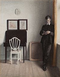
Here's some other pieces:
Interior with young man Reading (1898):
What is he reading? Again, check out the shadowing.
Interior of Courtyard:
What is she looking at? Did she drop something? Look at the light and darkness.
Here's some elements of Interior with Easel that are unsettling:
- Why is the painting on the wall so high up?
- Why is the easel turned towards the wall, away from us, with no chair or even room for a chair?
- Why is the door half open?
The mysteries really are endless with Hammershoi's works.
Here's what Halevy Street looks like today: --
---
Here's a summary I found online: --
https://www.sothebys.com/en/auctions/ecatalogue/2019/impressionist-modern-art-evening-n10067/lot.17.html
Caillebotte’s La Rue Halévy, vue du sixième étage is the embodiment of the new Paris that emerged in the middle of the nineteenth century. Inextricably linked to the moment it depicts, the present work contains a profound originality that demonstrates Caillebotte’s development of novel modes of representation commensurate with the experience of modern life in nineteenth-century France. As one of the most remarkable in the series of his urban landscapes La Rue Halévy, vue du sixième étage exemplifies the innovative pictorial inventions for which Caillebotte was celebrated. Caillebotte made his debut with the Impressionist group during their second organized exhibition in 1876. The works he chose to exhibit were praised for their ingenuity and their creator lauded. Critic Marius Chaumelin exclaimed: “Who knows Mr. Caillebotte? Where does Mr. Caillebotte come from? At what school did Mr. Caillebotte receive his training? Nobody could tell me…” He went on to say, “All I know is that Mr. Caillebotte is one of the most original painters to be revealed in several years, and I am not afraid of compromising myself by predicting that he will be famous before long. In his Floor Scrapers, Mr. Caillebotte proves to be a realist just as crude but more witty than Courbet, as violent but more precise than Manet…. If intransigence meant painting this way, I would advise our young school to become intransigent” (quoted in Gustave Caillebotte: The Painter’s Eye (exhibition catalogue), op. cit., p. 100). Caillebotte would go on to exhibit with the Impressionist group in the majority of their subsequent exhibitions including the Fourth Impressionist Exhibition in 1879 where Caillebotte submitted La Rue Halévy, vue du sixième étage.
From 1875 until 1882 Caillebotte made several paintings that thematized novel vantage points, exploring the confrontation between interior and exterior spaces in the new city (see figs. 1 & 2). Caillebotte’s scenes of urban realism would become his hallmark and these paintings were a testament to the transformation of the city of Paris in the middle of the nineteenth century. As part of the ambitious reforms Napoleon III introduced during the 1860s, Georges-Eugène Haussmann was charged with masterminding a radical reconfiguration of Paris. Many parts of the medieval city were razed to provide space for an extensive grid of straight roads, avenues and boulevards (see fig. 3). The "Haussmannisation" of Paris, which is celebrated today as the precursor to modern urban planning, set the tempo for modern life. Haussmann’s expansive boulevards were the landscape of Parisian modernity and the setting of the ever-changing, ephemeral moments which formed the essence of the renovated city. Whereas the pre-Haussmannian, essentially Medieval Paris was made up of buildings that held interior courtyards, the modern apartment buildings that characterized the architecture of the new city had grand balconies and large windows that faced toward the street, offering startling new views of the boulevards below. Impressionist painters Camille Pissarro and Claude Monet frequently chose views of the French capital that captured the grandeur and commotion of the modern city (see fig. 4). Caillebotte explored this theme as well, painting in the midst of the bustling streets and in innovative compositions from an elevated vantage point above.
In La Rue Halévy, vue du sixième étage the artist has adopted a viewpoint well above the lively city boulevards below. The plunging perspective is heightened by the embrasure of window visible along the left edge which further enhances the sense of a place, a window on the upper floors overlooking the urban environment. From his elevated vantage point Caillebotte is afforded the freedom to view and manipulate perspective, tilting the ground of the picture plane in a manner that has been considered characteristic of his work and one of his greatest contributions in the move towards Modernism. Much like his vision of life in modern Paris, Caillebotte’s style combines new and old in a thoroughly contemporary manner; he retained a clarity in his draftsmanship that is related more to the French realist tradition, and yet uses radical compositional and perspectival devices that are entirely avant-garde.
The first owner of La Rue Halévy, vue du sixième étage was Caillebotte’s life-long friend, Paul Hugot. Hugot was an early supporter of Caillebotte and owned the largest collection of his work outside the Caillebotte family, including a life-size portrait the artist painted of Hugot in 1878. La Rue Halévy, vue du sixième étage was later in the notable collection of prominent New York industrialist Chester Roth. The present work has been included in major retrospective exhibitions of Caillebotte’s work and in numerous publications as a supreme example of the artist’s pioneering urban naturalism.
You may remember him from Planers of a small apartment:
Caillebotte, like many of his contemporary impressionists, sought to depart from the rigid traditions of the Académie des Beaux-Arts (The Academy). The Academy upheld long-standing French artistic traditions of the Baroque and Renaissance including using dull colors and even finishing paintings with a gold tarnish to reduce the colors.
But in the age of industrialism, many new colors of paint were available to artists. Which lead to more vivid paintings, and the Academy largely rejected these. They could not get a spot in the yearly display of works until Napoleon saw their works and called for a Salon of the Rejected.
In this painting we see a still life of wilted roses. Believe it or not this was basically a slap in the face to traditional painters. They would never paint a still life of flowers, and expect it to be taken seriously, and even more insulting the flowers were wilted.
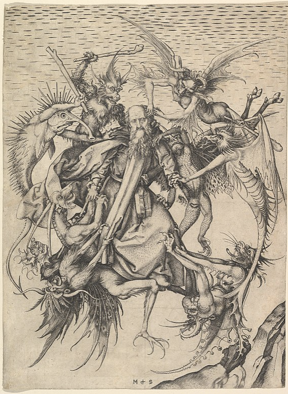
Believed to be Michelangelo's first easel painting, completed when he was 12 or 13. Based largely on an engraving by Martin Schongauer, down to the demon's whiskered asshole:
Michelangelo's Temptation is a mishmash of styles, particularly High Renaissance and Late Middle Ages. The foreground, ie St. Anthony being attacked by demons, is indicative of Late Middle Age art, whereas the intricate background is more on par with the Renaissance, which sought to improve on the classical art style (Ancient Greek and Roman) via realism. (https://en.wikipedia.org/wiki/High_Renaissance, https://en.wikipedia.org/wiki/Late_Middle_Ages)
From wikipedia:
> The Torment of Saint Anthony (or The Temptation of Saint Anthony is attributed to Michelangelo, who painted a close copy of the famous engraving by Martin Schongauer when he was only 12 or 13 years old. Whether the painting is actually by Michelangelo is disputed. This painting is now in the Kimbell Art Museum in Fort Worth, Texas. It shows the common medieval subject, included in the Golden Legend (a big book of saints from mediaeval times) and other sources, of Saint Anthony (AD 251 – 356) being assailed in the desert by demons, whose temptations he resisted; the Temptation of St Anthony (or "Trial") is the more common name of the subject. But this composition apparently shows a later episode where St Anthony, normally flown about the desert supported by angels, was ambushed in mid-air by devils.
From the Kimbell:
The cleaning of Michelangelo’s Torment of Saint Anthony at the Metropolitan Museum of Art, New York, in 2009, revealed the quality of the small panel. Michael Gallagher, conservator in charge of paintings conservation, removed the layers of yellowed varnish and clumsy, discolored overpaint that obscured the artist’s distinctive palette and compromised the illusion of depth and sculptural form. The technical study accompanying the cleaning provided evidence of pentimenti, or artist’s changes, signifying that the painting is an original work of art and not a copy after another painting.
Comparison of Michelangelo’s work with Schongauer’s print reveals the many ways the novice artist distilled, edited, and expanded his northern source. Most obviously, unlike Schongauer, Michelangelo set the figures against a landscape, one that resembles the familiar Arno River Valley around Florence. In addition, following a trip to the fish market, Michelangelo heightened the naturalism of Schongauer’s demons by painting silvery scales onto the spiny, fishlike monster in the upper left. In translating Schongauer’s black-and-white print into color, Michelangelo also made the creatures more lifelike. (Keith Christiansen has noted that Michelangelo’s idiosyncratic use of shades of lavender, green, and orange invites comparison to his palette in the ceiling frescoes of the Sistine Chapel.)
The young artist introduced the element of fire, which does not appear in Schongauer’s print. A small fire appears in the crevice of the rocky outcrop, flames shoot from the mouth of the demon with squid-like wings at the lower right, and a wooden club wielded by the spiny, fishlike creature has been transformed into a firebrand.
Michelangelo increased the scale of the figures and made thoughtful, calibrated shifts in their placement and the ways they interconnect, which resulted in a complete rethinking of the negative spaces between them. He straightened the tilt of Saint Anthony’s head, altered his expression, added a halo, and simplified the saint’s drapery folds. The artist reframed the heads of the demons by refining the space around them, emphasizing their fantastic, bizarre features. He also intensified the drama by moving the horns of the long-necked demon in the lower left so that the demon below could bite one of them. Overall, these changes produce a more compelling and direct figural group.
While many of Michelangelo’s changes to Schongauer’s composition are obvious to the eye alone, technical analysis carried out during cleaning—which included X-radiography, pigment analysis, infrared reflectography, and close examination under the microscope—has shed light on many other aspects of the artist’s early working methods. Adopting the egg tempera technique still practiced in Ghirlandaio’s studio, Michelangelo covered the background with continuous, parallel, horizontal brushstrokes. He modeled the saint’s face with delicate hatched brushwork over a green underpaint. X-radiography confirmed that Michelangelo executed the painting on a poplar panel and that, in the process of laying in the background, he saved space for the figure of Saint Anthony and two of the demons. The work has survived in excellent condition with only minor flake losses and some wormholes.
The infrared reflectogram mosaic captured by Charlotte Hale at the Metropolitan Museum of Art reveals the character and extent of Michelangelo’s preparatory underdrawing. The artist used two types of underdrawing in The Torment of Saint Anthony: simple, broad, black-brush outlining for the figures and drapery and much finer, more detailed underdrawing in the landscape, perhaps in silverpoint. Since the artist invented the scenery, it likely required greater preparation than the figures, which were modeled after Schongauer. With its fine, curved, parallel hatching, Michelangelo’s underdrawing in the rocky outcrop of The Torment of Saint Anthony resembles the style of his early drawing after Giotto’s fresco The Ascension of Saint John, a copy he made as part of his artistic training.
The infrared reflectogram mosaic also recorded two areas of pentimenti where Michelangelo deviated from his initial underdrawing, confirming that he continued to make critical changes at the moment of painting. He shifted the wooden club held by the spiny, fishlike monster from the angle seen in Schongauer to a more vertical position and pulled in the arc of his long tail to encircle the head of the biting monster.
Examination of the paint surface of The Torment of Saint Anthony under the microscope shows an extraordinary assurance of execution and variety of paint application as well as the effort made by the young Michelangelo to perfect his composition. The heavy layering of paint in some of the demons suggests that the artist’s choice of color evolved as he transformed the black-and-white figures into colored beasts. Michelangelo applied pigment with brushes but then frequently attacked the surface with a sculptor’s tool. He scraped away paint along the back of the spiny, fishlike monster, exposing the underlying gesso and enhancing the sculptural form of the thick scales, which are painted in relief. The artist also sharpened the outlines of the demon with incisions. In a final stage of painting, Michelangelo made numerous adjustments to edges throughout the composition using the light background color. The exacting nature of these corrections suggests his obsession with the refinement of these contours.
The combined techniques of painting in relief, scraping, and incising have been previously noted in The Manchester Madonna and The Entombment, two unfinished works by the artist in the National Gallery, London. When considered together with the documentary evidence of Condivi and Vasari’s biographies as well as stylistic analysis, the technical examination of The Torment of Saint Anthony adds powerful evidence that the Kimbell panel is Michelangelo’s first easel painting.
https://kimbellart.org/content/michelangelo-torment-saint-anthony
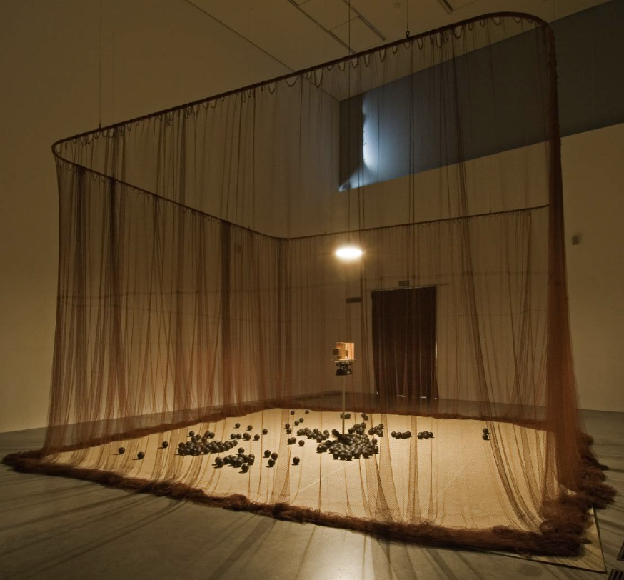
Here's the summary from the Tate Modern Art Museum (available here https://www.tate.org.uk/art/artworks/meireles-babel-t14041). I have modified some of it to read easier, and supply context.
Babel is a large-scale sculptural installation that takes the form of a circular tower made from hundreds of second-hand analogue radios that the artist has stacked in layers. The radios are tuned to a multitude of different stations and are adjusted to the minimum volume at which they are audible. Nevertheless, they compete with each other and create a cacophony of low, continuous sound, resulting in inaccessible information, voices or music.
In describing this work, Meireles refers to a tower of incomprehension. The installation manifests, quite literally, a Tower of Babel, relating it to the biblical story of a tower tall enough to reach the heavens, which, offending God, caused him to make the builders speak in different tongues. Their inability to communicate with one another caused them to become divided and scatter across the earth and, moreover, became the source of all of mankind’s conflicts. The room in which the tower is installed is bathed in an indigo blue light that, together with the sound, gives the whole structure an eerie effect and adds to the sense of phenomenological and perceptual confusion. The radios are all of different dates, the lower layers nearest the floor being composed of older radios, larger in scale and closer in kind to pieces of furniture, while the upper layers are assembled from more recent, mass-produced and smaller radios. This arrangement emphasises the sense of perspectival foreshortening and thus the impression of the tower’s height, which, like its biblical counterpart, might continue into the heavens.
The artist has explained that the work took over ten years to complete from initial conception to its realisation:
>Babel began in 1990 on Canal Street, in New York. There were eleven years of notes before I finally realised the work in 2001, in Helsinki, at the Kiasma Museum of Contemporary Art. Upon observing the quantity and diversity of radios and all the different types of sound objects that were sold around Canal Street, I thought of making a work with radios. Radios are interesting because they are physically similar and at the same time each radio is unique.
The title and themes of Babel also relate to one of Meireles’s most important and ongoing influences, the Argentinean writer Jorge Luis Borges (1899–1986). Borges’s fiction also provides one of the key references for another major work by Meireles in Tate’s collection, Eureka/Blindhotland 1970–5 (Tate T12605),
which draws on Borges’s short story ‘Tlön, Uqbar, Orbis Tertius’,
>Told in a first-person narrative, the story focuses on the author's discovery of the mysterious and possibly fictional country of Uqbar and its legend of Tlön, a mythical world whose inhabitants believe a form of subjective idealism, denying the reality of objects and nouns, as well as Orbis Tertius, the secret organization that created both fictional locations. Relatively long for Borges (approximately 5,600 words), the story is a work of speculative fiction. (https://en.wikipedia.org/wiki/Tl%C3%B6n,_Uqbar,_Orbis_Tertius)
first published in 1940. A further connection between the two works is their use of sound as a sculptural and perceptual element. Here, however, Meireles has borrowed a symbol that is central to Borges’s writing. In his story ‘The Library of Babel’, originally published in 1941, Borges described a universe in the form of a vast or conceptually complete library that has its centre everywhere and its limits nowhere. This corresponds to Meireles’s interest in expanded notions of space and of infinity, in an excess of perceivable information and the processes of cognition.
The curator and writer Moacir dos Anjos has also related Babel to another of Borges’s stories, ‘The Aleph’ (1945), which describes a point where all places in the universe can be seen from every angle. Dos Anjos makes links between Meireles’s work and Borges’s story, suggesting that both question the ‘rigid codes’ that govern our perception of the world and ‘that are unable to grasp the fluidity with which the body traverses and experiences it’ (Moacir dos Anjos, ‘Where All Places Are’, in Tate Modern 2008, p.170). Dos Anjos suggests that the presentation of informational overload in Babel can be seen as a metaphor ‘for the intricate relations between distinct nations and communities’ which insists on ‘recognising the existence of a territory with uncertain boundaries, one that accommodates multiple oppositions and produces the multiple contamination of cultural expressions previously separated by geographical and historical injunctions’ (dos Anjos 2008, p.173).
Tanya Barson May 2011
A Polish artist and recluse, little is known about the painter. He also didn't seem to name any of his work. He died in 2013.
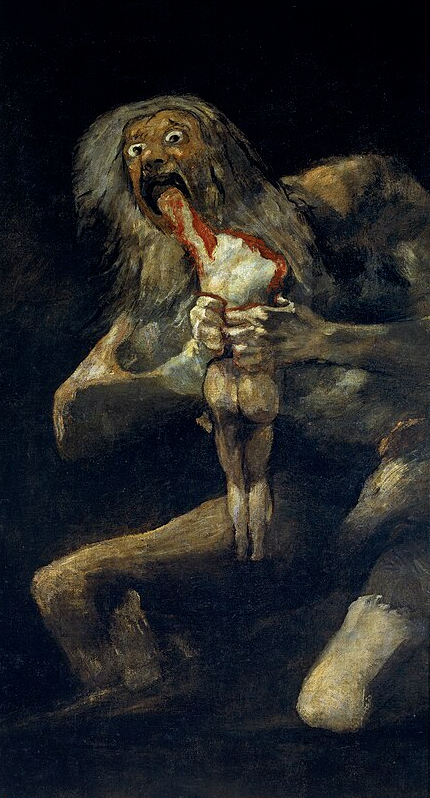
This painting by Goya (of Saturn Eating his Son fame) came from a group of smaller paintings that Goya executed - because the topic interested him rather than commissioned. Both as a visual narrative and as a painting per se it is influenced by Goya’s keen interest in the grim fate that befell many people during his lifetime. The painting shows monks, soldiers, and convicted prisoners in white robes, probably on their way to the site of their execution.
Summarized from: https://www.nasjonalmuseet.no/en/collection/object/NG.M.01347
Unlike his Impressionist friends, Degas was an essentially urban painter, who liked to paint the enclosed spaces of stage shows, leisure activities and pleasure spots.
In a cafe, a fashionable meeting place, a man and a woman, although sitting side-by-side, are locked in silent isolation, their eyes empty and sad, with drooping features and a general air of desolation. The painting can be seen as a denunciation of the dangers of absinthe, a violent, harmful liquor which was later prohibited. Parallels have been drawn with Zola's novel L'Assommoir written a few years later and indeed the novelist told the painter: "I quite plainly described some of your pictures in more than one place in my pages." The realistic dimension is flagrant: the cafe has been identified - it is "La Nouvelle Athènes", in place Pigalle, a meeting place for modern artists and a hotbed of intellectual bohemians. The framing gives the impression of a snapshot taken by an onlooker at a nearby table. But this impression is deceptive because, in fact, the real life effect is carefully contrived. The picture was painted in the studio and not in the cafe.
Degas asked people he knew to pose for the figures: Ellen André was an actress, and an artist's model; Marcellin Desboutin was an engraver and artist. The painting cast a slur on their reputations and Degas had to state publicly that they were not alcoholics.
The off-centre framing, introducing empty spaces and slicing off the man's pipe and hand, was inspired by Japanese prints, but Degas uses it here to produce a drunken slewing. The presence of the shadow of the two figures painted as a silhouette reflected in the long mirror behind them is also expressive and significant.
https://www.edgar-degas.net/in-a-cafe.jsp
