Although the bar chart is objectively better, especially the 3d ones, the pie chart is more intuitive and simpler to understand for a lot of people.
A halfway point in between is the tree map chart example
The color blindness problem can mostly be avoided. The tiny slices issues can be present in all three including the bar chart, for example if we have this data (these are percentages): 50 30 18 0.5 0.3 0.2 etc... The final bar chart would be either too long or too squished.
In a tree map chart, by moving the data/squares around you can avoid the problem of the squares being squished which the author is complaining about
You're getting downvoted because people don't like the way the real world works.
Fuck yeah
Has some of my top marty robbins songs like " They're hanging me tonight" and cool water
Not to mention it has part of the El Paso Trilogy
Calling this genocide dilutes the importance of the word
I get unlimited skips on Spotify web desktop
For mobile i used to use a cracked version
Meant cook county, no need to be a jackass, jackass
Not exactly, you can read piss shit fuck, however other words like maybe removed, removed, removed, removed may be censored
Edit: didn't think this one through lmao
W hor e
Bi tch
G**k
N**er
But the article specifies chicago area, ie cook county which votes blue
Edited for semantics
Illinois has been voting blue since 1992, the current president is a Democrat, what does this have to do with republicans?
Argentina's been gone for years
I can be rich but if I know how to shake a vending machine for free food I'll do it
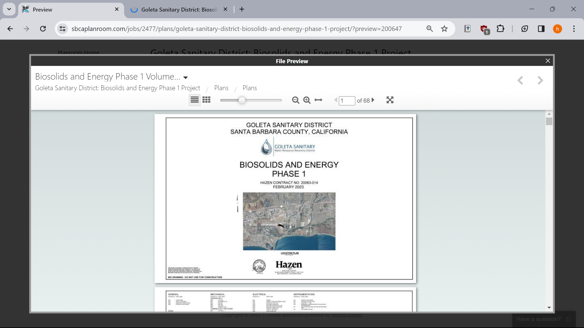
Ok so I want to download this embedded PDF/document in order to physically print it. The website allows me to view it as much as I want, but is asking me to fork over 25 + tax USD so i can download the document.
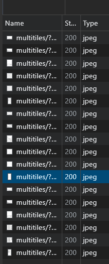
Obviously, i don't want to do that, so I try to download the embedded document via inspect element. But, the weird thing is it not actually loading a pdf, but like really small pictures of each page:
So, my question is basically how can I download this document in order to print it?
PdF link: https://www.sbcaplanroom.com/jobs/2477/plans/goleta-sanitary-district-biosolids-and-energy-phase-1-project/?preview=200647
Sorry if this is obvious question