Introducing SUSE Typeface: SUSE’s new open sourced font
Introducing SUSE Typeface: SUSE’s new open sourced font

www.suse.com
Introducing SUSE Typeface: SUSE’s new open sourced font
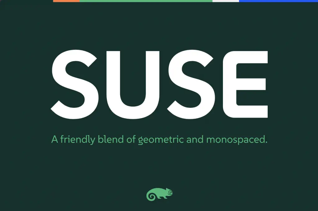
SUSE just open-sourced a typeface :)
Introducing SUSE Typeface: SUSE’s new open sourced font
Introducing SUSE Typeface: SUSE’s new open sourced font
SUSE just open-sourced a typeface :)
What is going on with that lowercase g?
That’s fairly standard for serif fonts like times new roman, baskerville, etc. Although it is uncommon in modern sans serif fonts and/or fonts designed to be viewed on a screen.
The Fira family has a similar fancy g for some reason
Here in Germany at least, if you read almost any printed novel, the type face will include this type of g. It’s so common, that I didn’t realise it’d be strange for some people.
(Although I do recall seeing a post about a kid that was confused by that weird letter, somewhere a while ago. Probably was still back on r*****)
Huh, just realized that the r-word and “Reddit” have the same number of characters.
Yeah it's common. I'm not confused by it, just like a normal g more.
The commenter I responded to originally seemed confused/surprised by it, though.