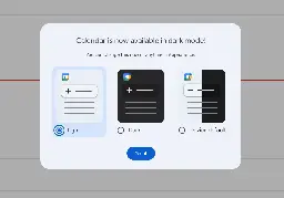
Google Calendar's web client finally gets a dark mode
Google Calendar's web client finally gets a dark mode
www.engadget.com Google Calendar's web client finally gets a dark mode
Google Calendar's web client just got a redesign with new buttons, dialogs and sidebars. Users can also now toggle between light and dark mode.

Google Calendar's web client just got a redesign with new buttons, dialogs and sidebars. Users can also now toggle between light and dark mode.
4
comments
I've been using dark mode for ages with dark reader. I honestly didn't know it didn't have a native dark mode.
8 0 ReplySummer intern did work I guess
6 1 ReplyLiking the darkmode but my ADHD brain wishes they would let you scroll the calendar up and down rather than flip pages month to month.
2 0 ReplyJust a basic features, took them a lot of time.
1 0 Reply