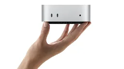
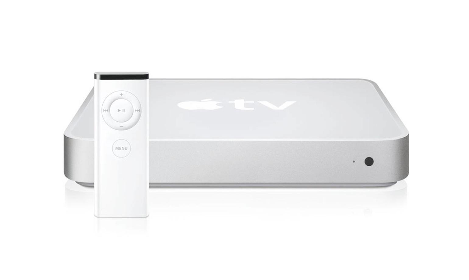
Apple’s first Mac mini redesign in 14 years looks like a big aluminum Apple TV
Apple’s first Mac mini redesign in 14 years looks like a big aluminum Apple TV
The smaller mini loses some ports but gets tons of other functional updates.

Implying Mac Minis haven't looked like Apple TVs from the beginning?
Mac Mini (2005-2009):

Apple TV (1st gen, 2007):

Mac Mini (2010, first redesign after Apple TV came out):

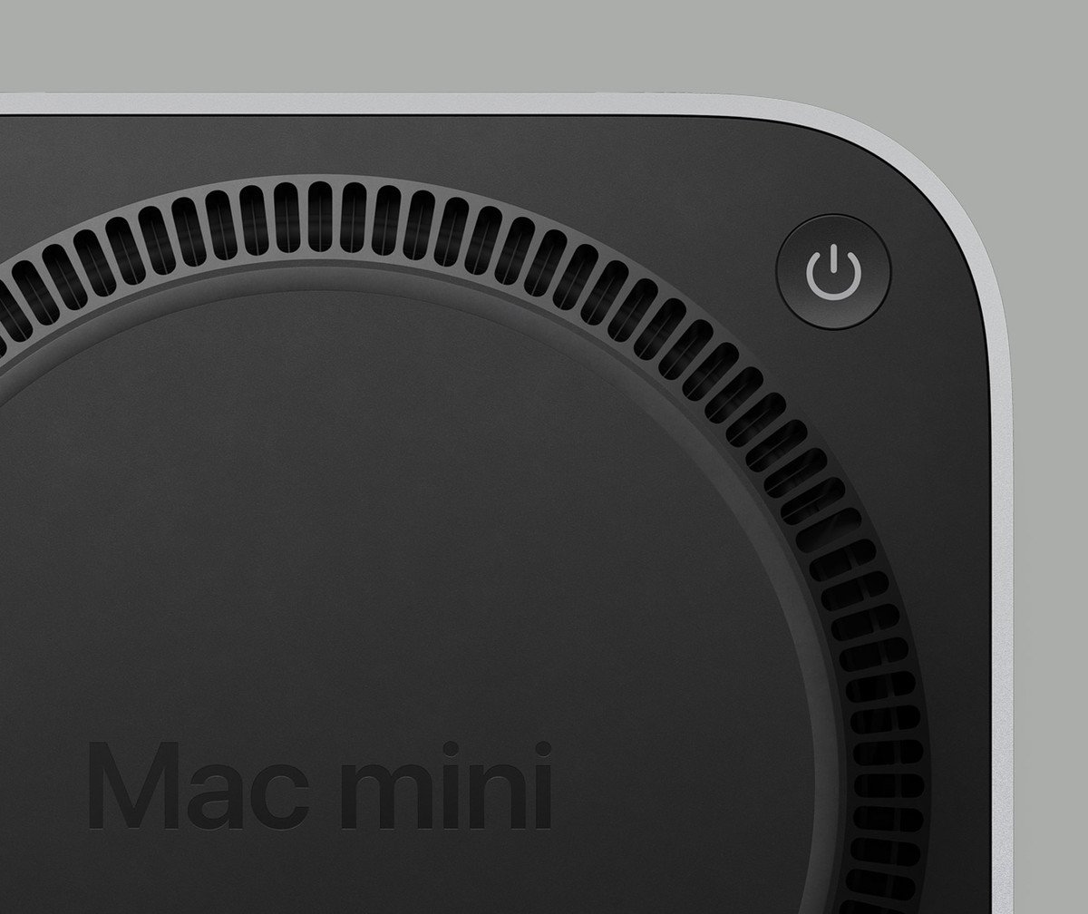
42 0 ReplyMac Mini's are cool, and I appreciate that Apple has some of the most experienced and talented designers in the world... But they put the power switch on the bottom. You have to lift it up and turn it over to turn it on and off.

137 6 ReplyWould rather buy a Beelink SER7.
6 0 ReplyWell, it would be
- more confusing if they shaped it like an iPhone,
- more unstable if they shaped it like the magic mouse with the power port at the bottom,
- super cute if they kept the exact mac pro tower design but super smol,
- actually useful as a vase of they used that cylinder mac pro design from 10 years ago
45 1 ReplyMost, if not all, Apple devices look almost exactly the same as their sibling devices.
49 1 ReplyThe price of the storage upgrades. Jesus.
32 0 ReplyWith the 10G NIC upgrade, I would see some use in this if it ran Linux
5 0 ReplyIt's kinda cute
22 1 ReplyWould it be so hard to get dual power supplies and a rack mount?
8 0 ReplyI mean.. It looks like the other Mac minis so... Okay.
12 3 ReplyThat doesn’t seem very good for the price.
18 16 ReplyWrong comment
1 0 ReplyMeanwhile... Apple TV stuck in stone age and still can't do bitstream.
1 3 Reply