Skip Navigation

Shakespeare Serif - an experimental font based on the First Folio
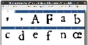
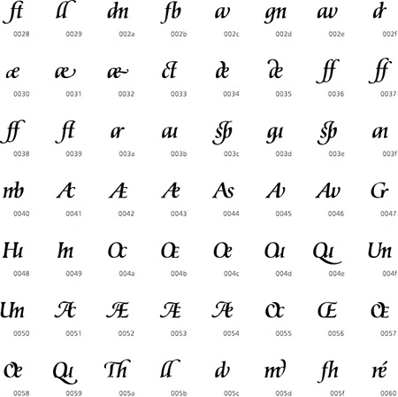
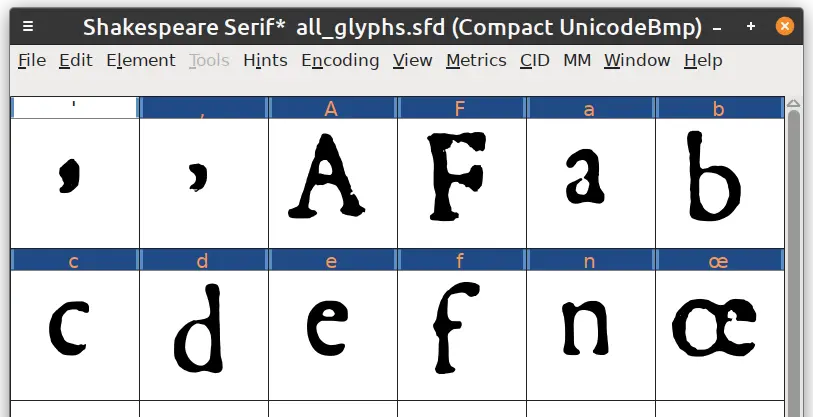
I've built a new font! Thoughts and feedback on my approach very welcome.

20 comments
  • Fantastic project! And thanks for the heads up about the 17th century Dutch fonts - I might consider that for the printed version of my thesis that will probably rot away in the university library anyway. Might as well make it interesting looking.

    My favourite project of this kind is TT2020, which takes typewriter imitation to the next level by including irregularities within the font itself. Each (common) glyph has several versions, making the outcome look much more genuine and allowing for the occasional badly printed glyph without making the same error repeat itself to infinity.

    It's a bit overkill maybe, but it would absolutely lend itself well to Shakespearian scripts. :)

  • Oh, I love everything about this project so much! It looks lovely!

    It also looks mighty useful for making handouts for TTRPG campaigns ahaha.

    Was the letter-recognition Python codeblock of your own making?

    • Cheers. The code was cobbled together by me from various random tutorials and things I had laying around.

  • Oooh, I'm excited to try this out! But later, 'cause I'm just on mobile, and kbin doesn't have a save function yet lol.

  • Looks nice

    • Cheers! I'm hoping to add some more letters and tidy up the rest when I have more time.

      • This is such a great project! I can see how there’s a little room for clean-up on that long S. Plus the comma-looking apostrophe 😵‍💫. Although maybe that’s how that punctuation mark acted back then?

20 comments