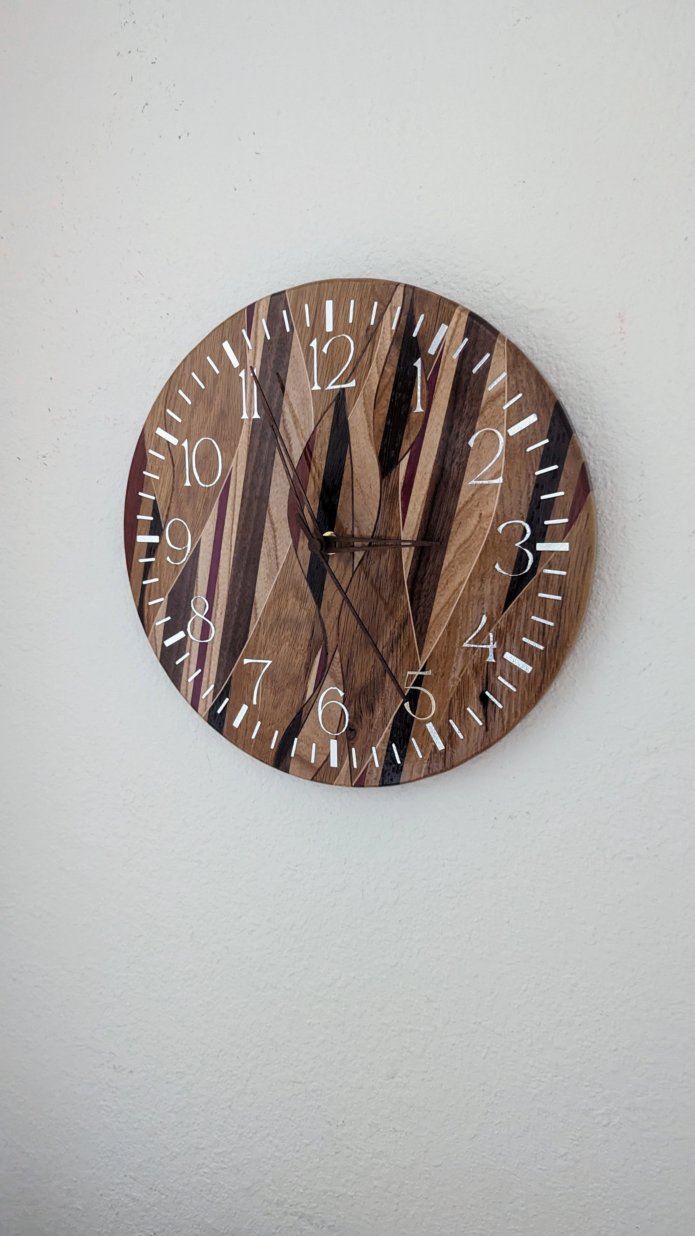
A clock I made for my wife for our 5th wedding anniversary. Its only the wood anniversary so no pressure, right?
A clock I made for my wife for our 5th wedding anniversary. Its only the wood anniversary so no pressure, right?
Full disclosure: I didn't make the clock hands, I just bought them off Amazon.
The Majority of the wood used is old (oak?) barn wood taken from the barn that we were married in front of on my family's farm. You can even see an old nail hole next to a hash mark between the 4 and the 5. Used primarily silver "shimmer" vinyl for the clock face which looks great in person but is an absolute nightmare to photograph. I've included a different, if not better, photo as well that shows that part more clearly.
I followed this Fisher's Shop video to learn how to get my weave on.
Update: I painted the hands silver and I think it looks much better.

It's beautiful, but I find it hard to see the hands. That black piece right in the middle looks almost like one of the hands to me, but maybe it's better in person. I think some white hands matching the color of the lettering might be better.
I agree with you 100%. My anniversary isn't for another week so I might pop the hands back off and paint them. Thanks for the feedback.
Update: I painted the hands silver and I think it looks much better. Thanks again to everyone in the thread for helping me take this gift from good to great.
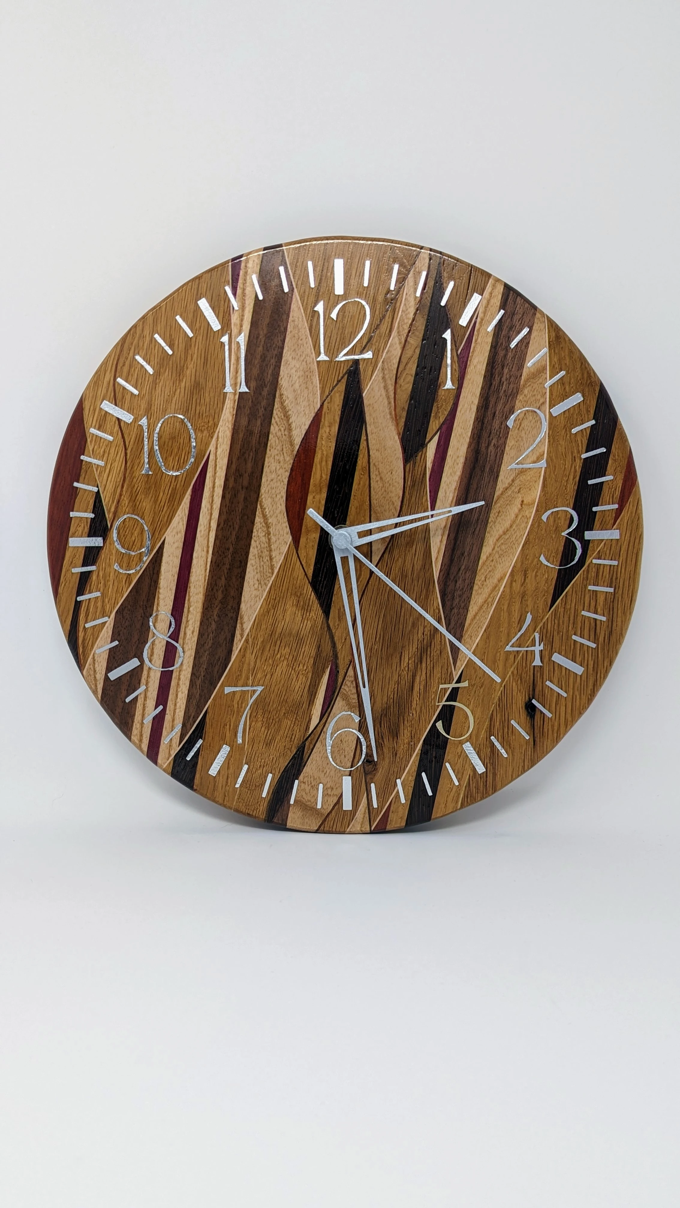
Wow, it looks amazing now! I expected that to make it easier to read, but it also shows off some nice details on the hands I didn't notice before.
Might the most beautiful clock I've ever seen. Nice work!
Incredibly kind of you to say, thank you!
I didn't even know you could get those cool designs with wood. Very neat.
Perfect and for the bronze anniversary you can give her the movement!
I try my best to give her the movement every anniversary!
So with pressure this will be a diamond watch in 35 years. xD
Awesome work!! 😊
.