Electricity Maps
Electricity Maps
Electricity Maps is a live 24/7 visualization of where your electricity comes from and how much CO2 was emitted to produce it.
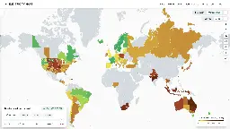
See near real time carbon intensity of electricity generation around the world.
The "noooo nuclear fission is not a viable way of generating reliable emission low energy" crowd not knowing any stats about France will hate this
The map is pretty biased against Germany, which is why it is brought up a lot in these kinds of discussions. Northern Italy for example has 409g/kWh and Germany 419g/kWh using production and covering the last twelve months. However Germany has 61% low carbon electricity share and Northern Italy 33%. Similar story with South Korea as well, which has also 33%, but slightly more emissions at 452g/kWh.
For anyone playing with this, don't forget to try showing historical data for regions of interest that seem to have no data. Sometimes there just isn't any data, like Manitoba, but sometimes it's like Saskatchewan, which only misses live data.
FWIW, as much as Alberta contributes to the problem via their tar sands, their electrical generation still seems to be greener than Saskatchewan's.
Poland 💀
Thanks! I love it
Ooo... Australia looks bad!
Even south Australia, which has the most renewable penetrative for a major grid, looks bad!
South Australia has a huge amount of solar and wind, but relativity little storage, and basically no renewable base load (hydro, geothermal, nuclear). While the average renewable energy usage is fairly high, the instantaneous renewable usage can drop to almost 0 some days.
Solutions are being implemented, and the renewable mix is gradually improving.
Source: Engineering with Rosie